My Work
Three-time Pentawards winner. Kraft, Cadbury, Coca-Cola, Tesco... Now working with brands like yours.
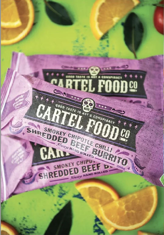
SCOPE: BRAND IDENTITY & PACKAGING DESIGN, ARTWORK PRODUCTION
Feeding the Cartel with Great Design
*
Feeding the Cartel with Great Design *
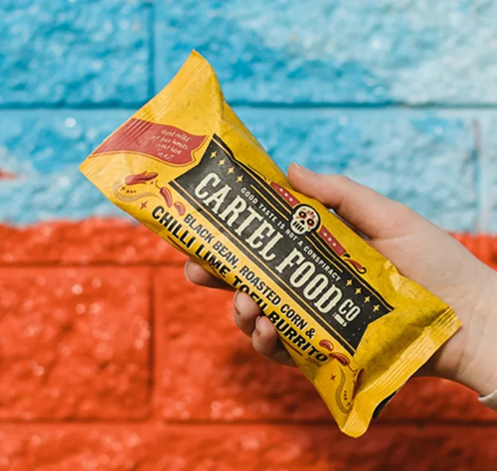
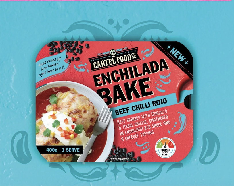
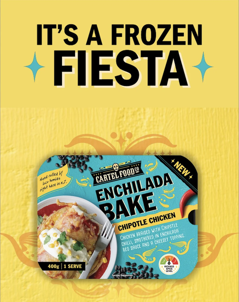
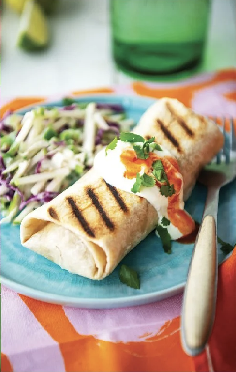
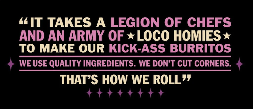
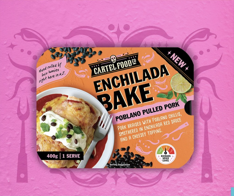
Cartel Food Company makes premium burritos that have no business being in the frozen aisle — and the packaging needed to match that ambition. The brief was to create a brand with genuine edge and personality, one that could cut through a category dominated by predictable photography and safe design choices.
The solution was bold colour, a distinctive illustration style, and language that grabs you before you've even reached for the freezer door. Cartel is well on their way to national burrito domination.

Neat, Evolved
SCOPE: BRAND IDENTITY & PACKAGING DESIGN, ARTWORK PRODUCTION
Standing out in a crowd is easy for Neat
*
Standing out in a crowd is easy for Neat *
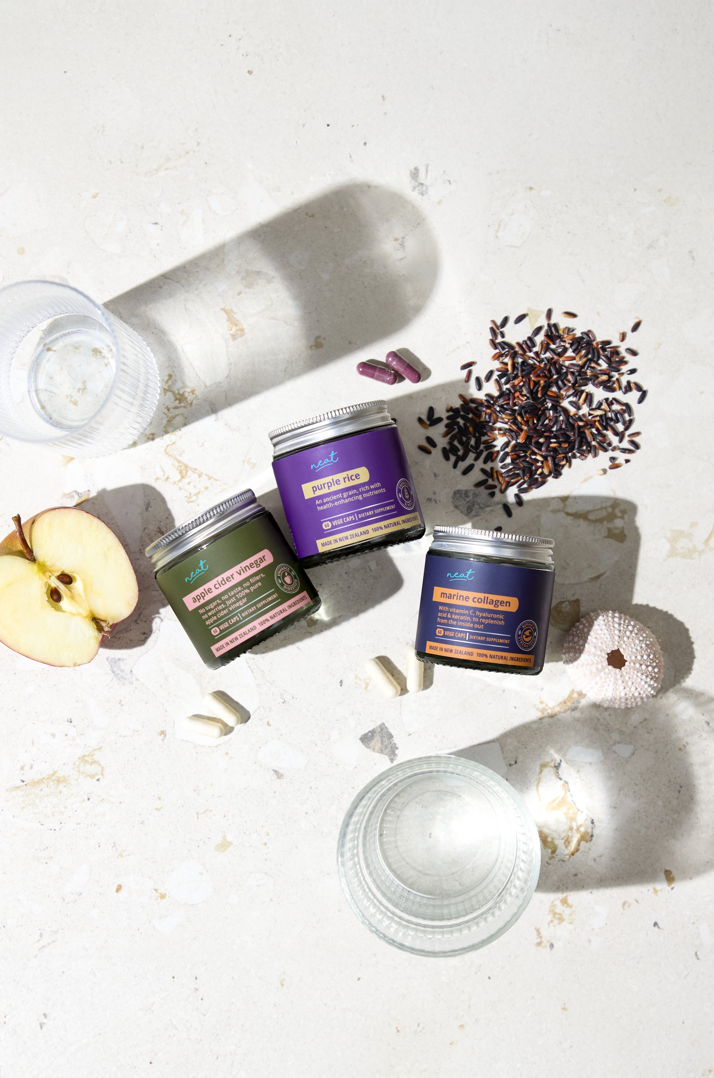
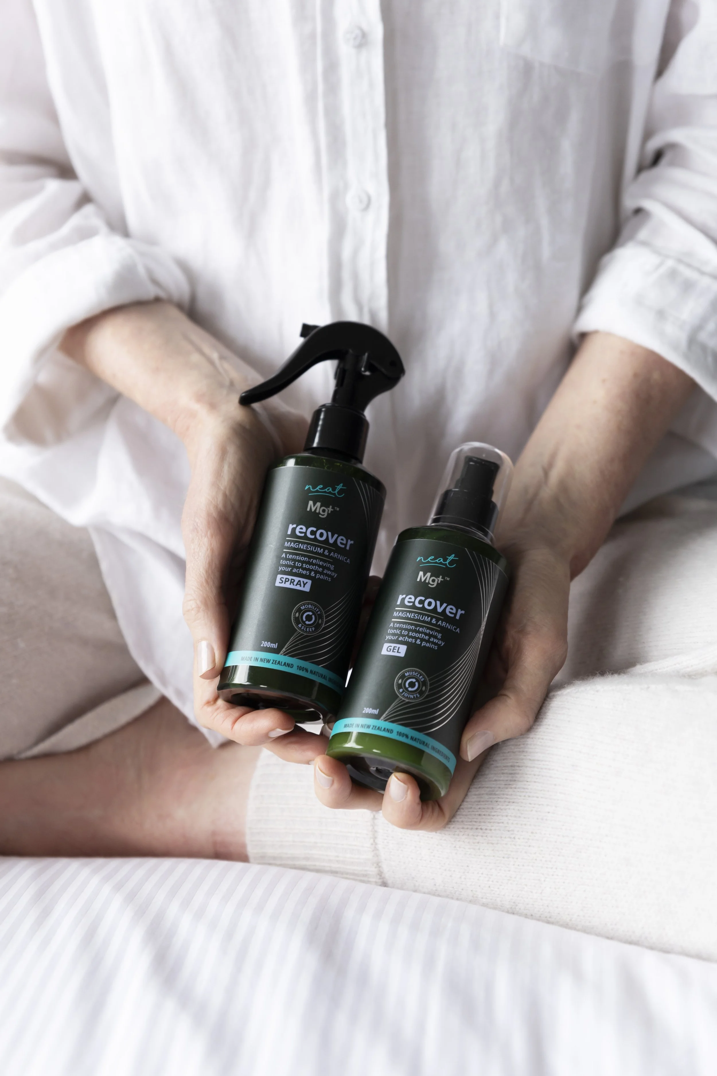
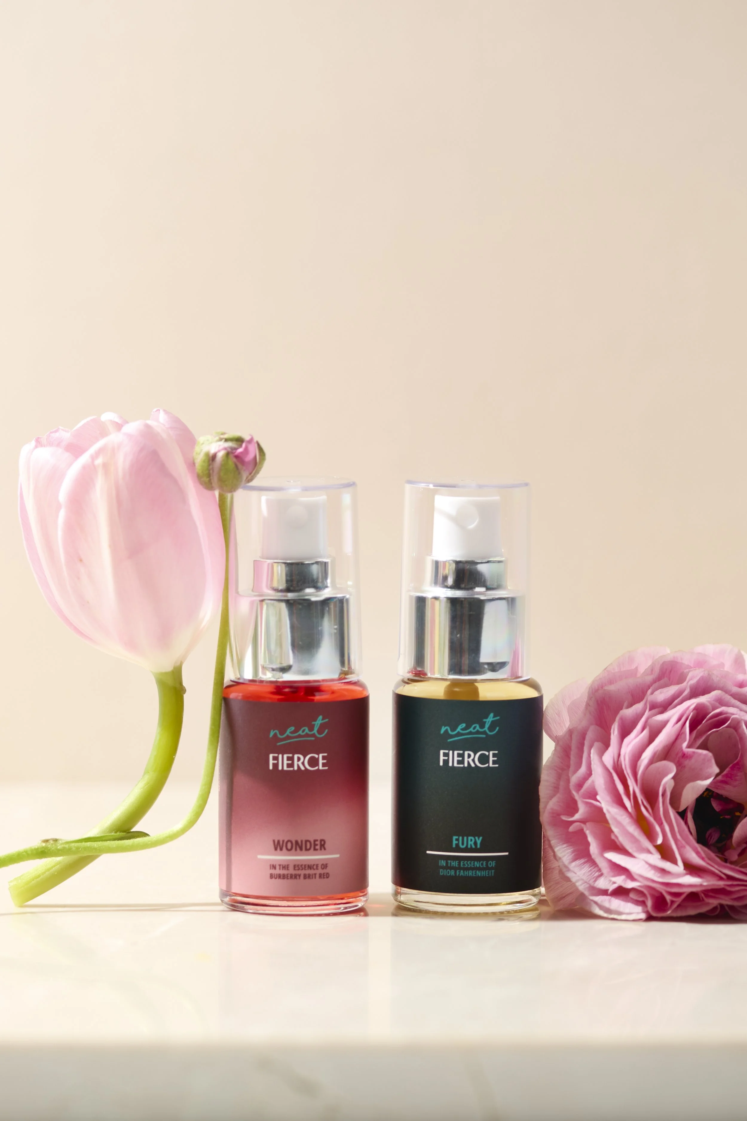
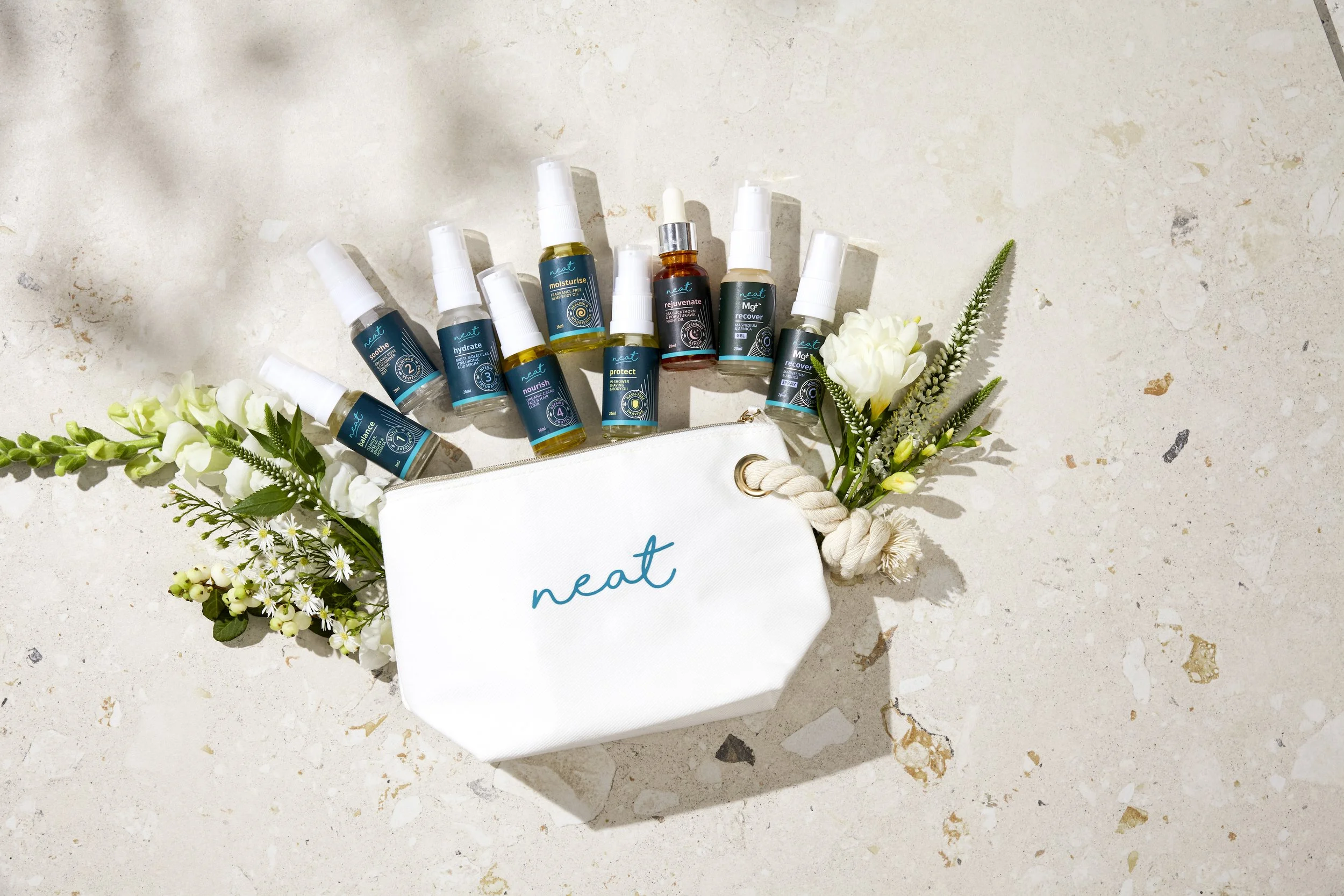
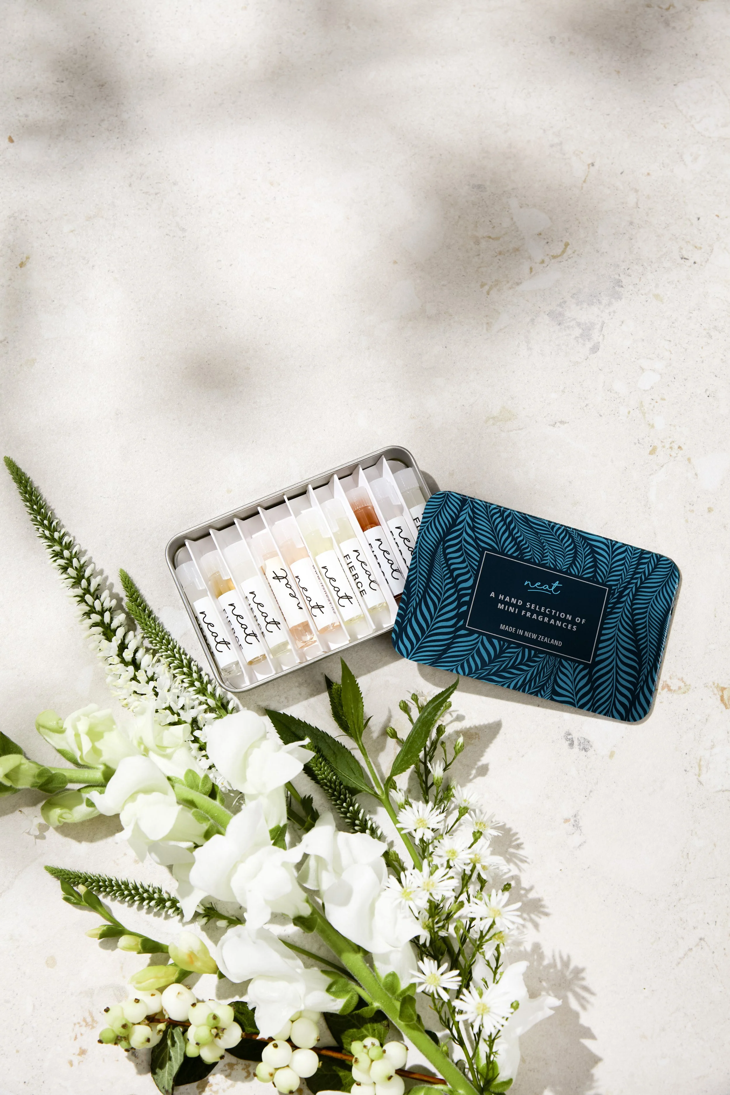
Neat NZ wanted to evolve their skincare and fragrance brand without losing what made it theirs. The challenge was keeping enough familiarity for existing customers while creating something modern enough to last. The result is a timeless design that owns their signature teal palette — and caught the attention of a major film production. Their products are set to feature in a globally released movie later this year.

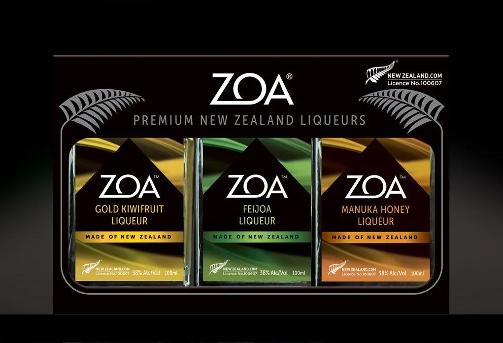
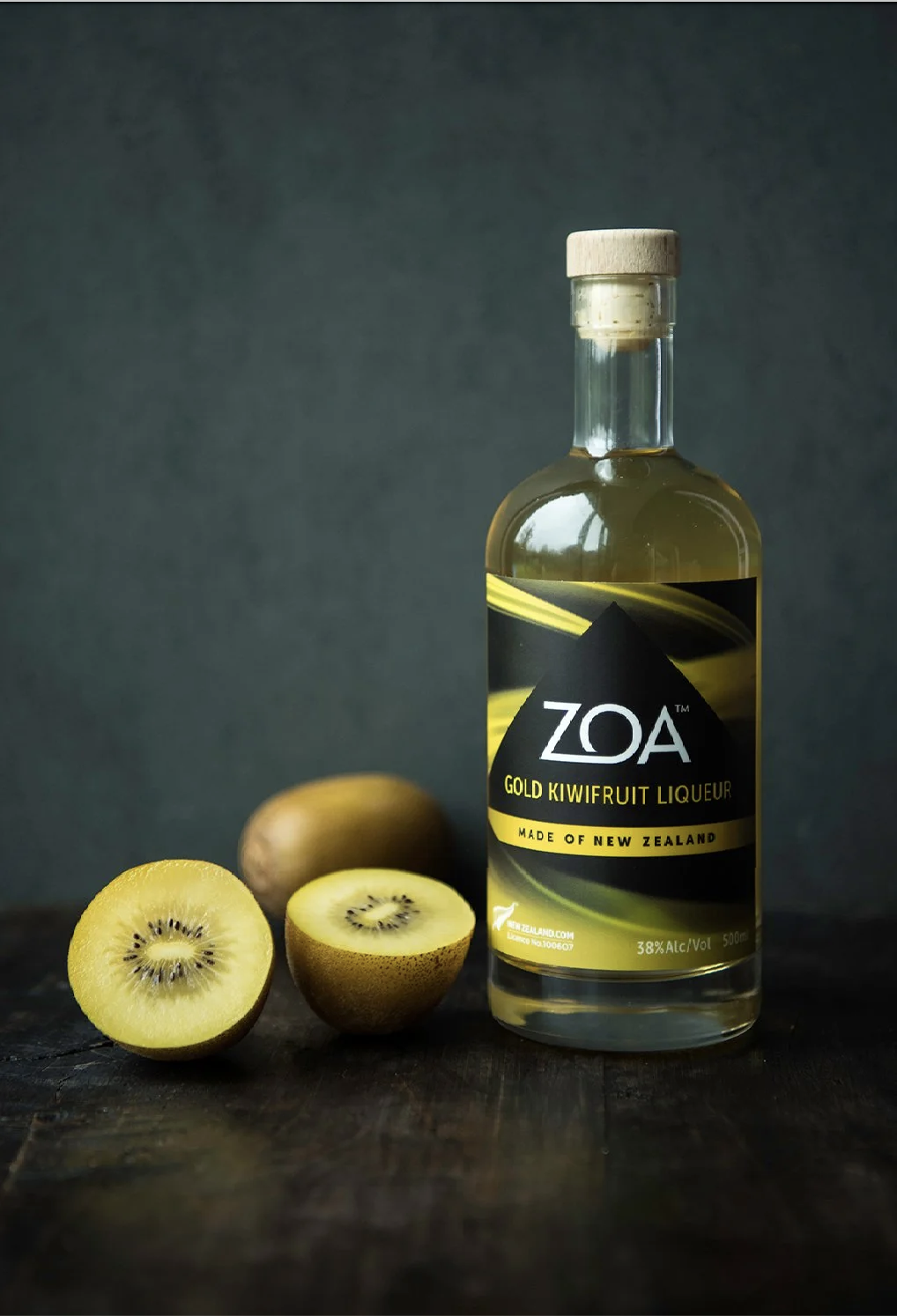
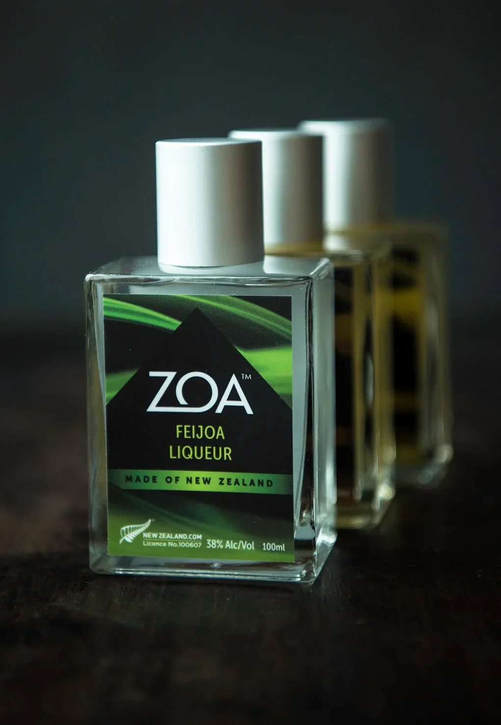
In a liqueur category full of heritage labels and traditional typography, Zoa needed to do something different.
Made from New Zealand ingredients in the village of Inglewood, at the foot of Taranaki Maunga, the product had a story worth telling visually.
The iconic mountain rising through swirling clouds became the centrepiece — capturing the distilling process and the purity of the product in a single, powerful image.
The result is packaging that leaps off the shelf.
Where the mountain meets the bottle
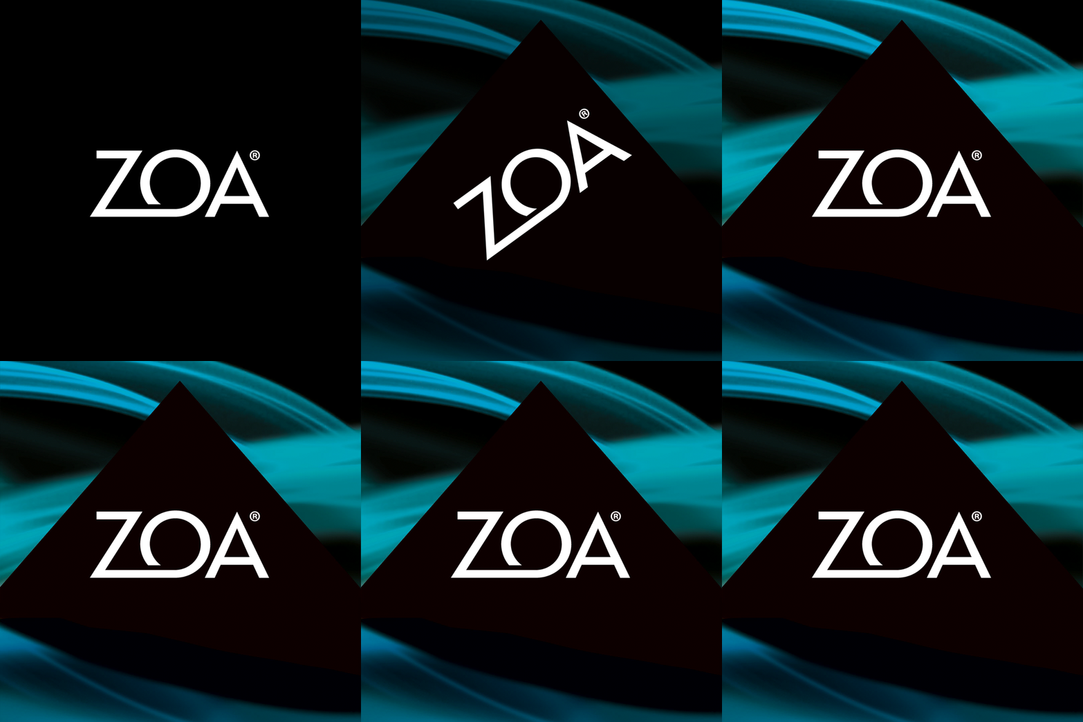
Made with intention — right down to the label.
SCOPE: BRAND IDENTITY & PACKAGING DESIGN, ARTWORK PRODUCTION
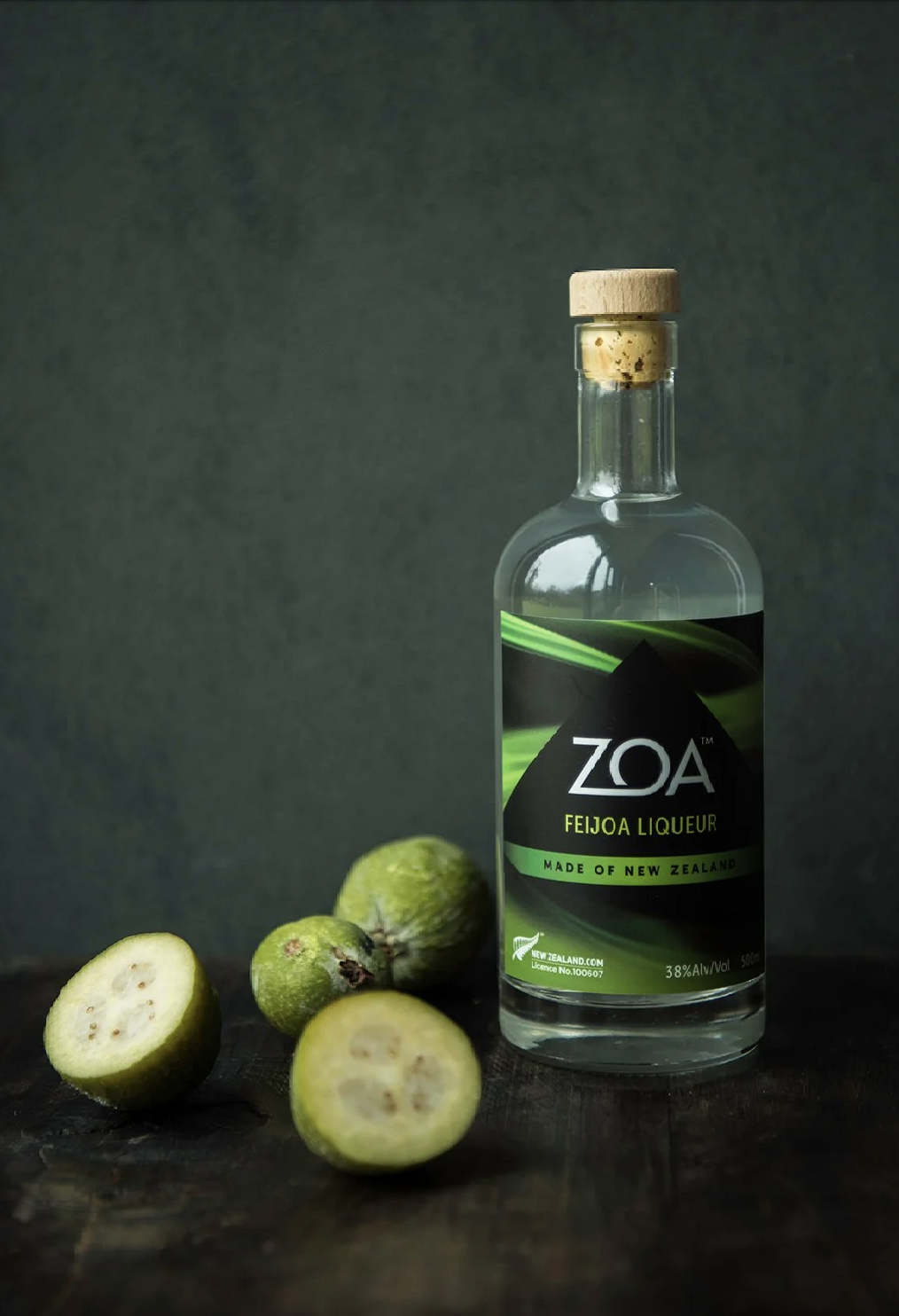
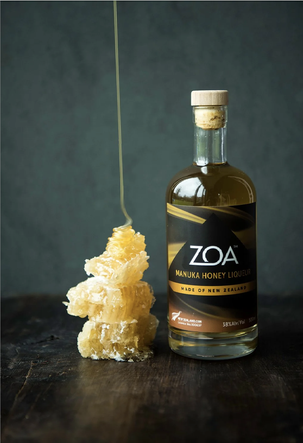
Speaking of Bold Flavours
*
Let's get Spicy!
*
Speaking of Bold Flavours * Let's get Spicy! *
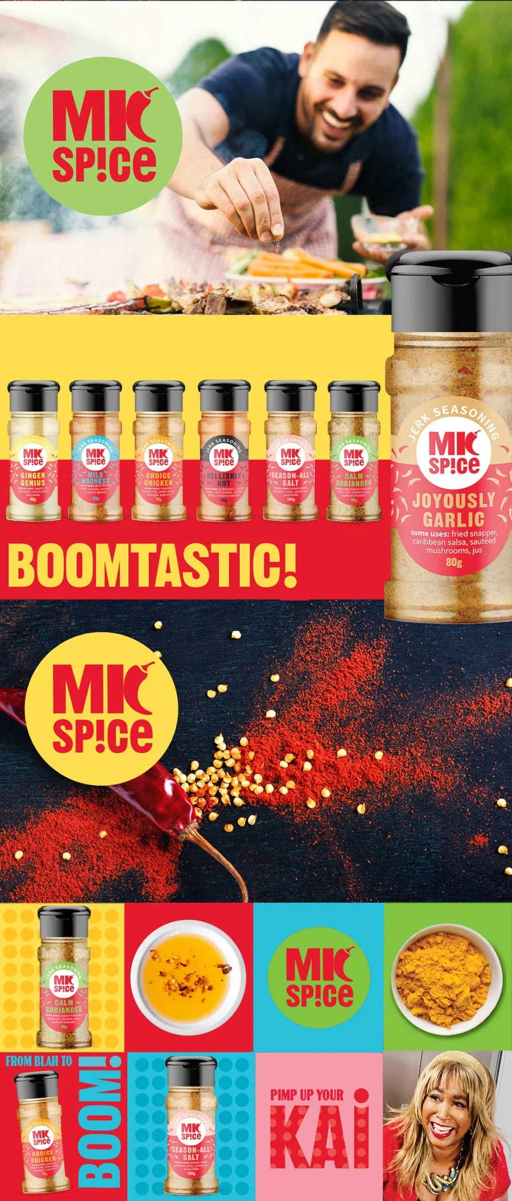
SCOPE: BRAND STRATEGY, BRAND IDENTITY, PACKAGING DESIGN, NAMING, BRAND TONE OF VOICE, DIGITAL BRAND ASSETS, ARTWORK PRODUCTION
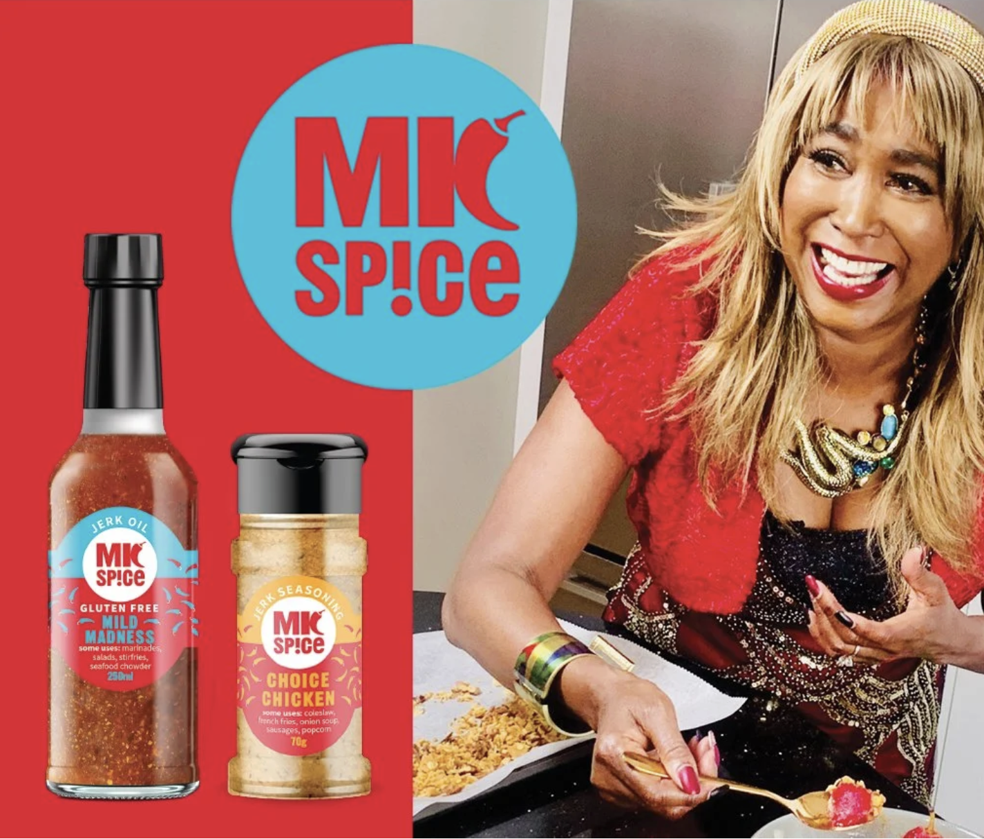
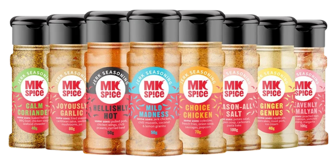
The rebrand leans fully into Marlaina's personality — vibrant colour, bold language and a graphic system flexible enough to work across the entire range. Consistency was key, but so was character. Even the product names deliver on both: Mild Madness and Joyously Garlic are impossible to forget.
When TV host, actor and entrepreneur Marlaina Curtis rebranded her jerk spice and oil range, she needed more than a new look — she needed packaging that felt like her.
Design So Good You Can Taste It!!
*
Design So Good You Can Taste It!! *
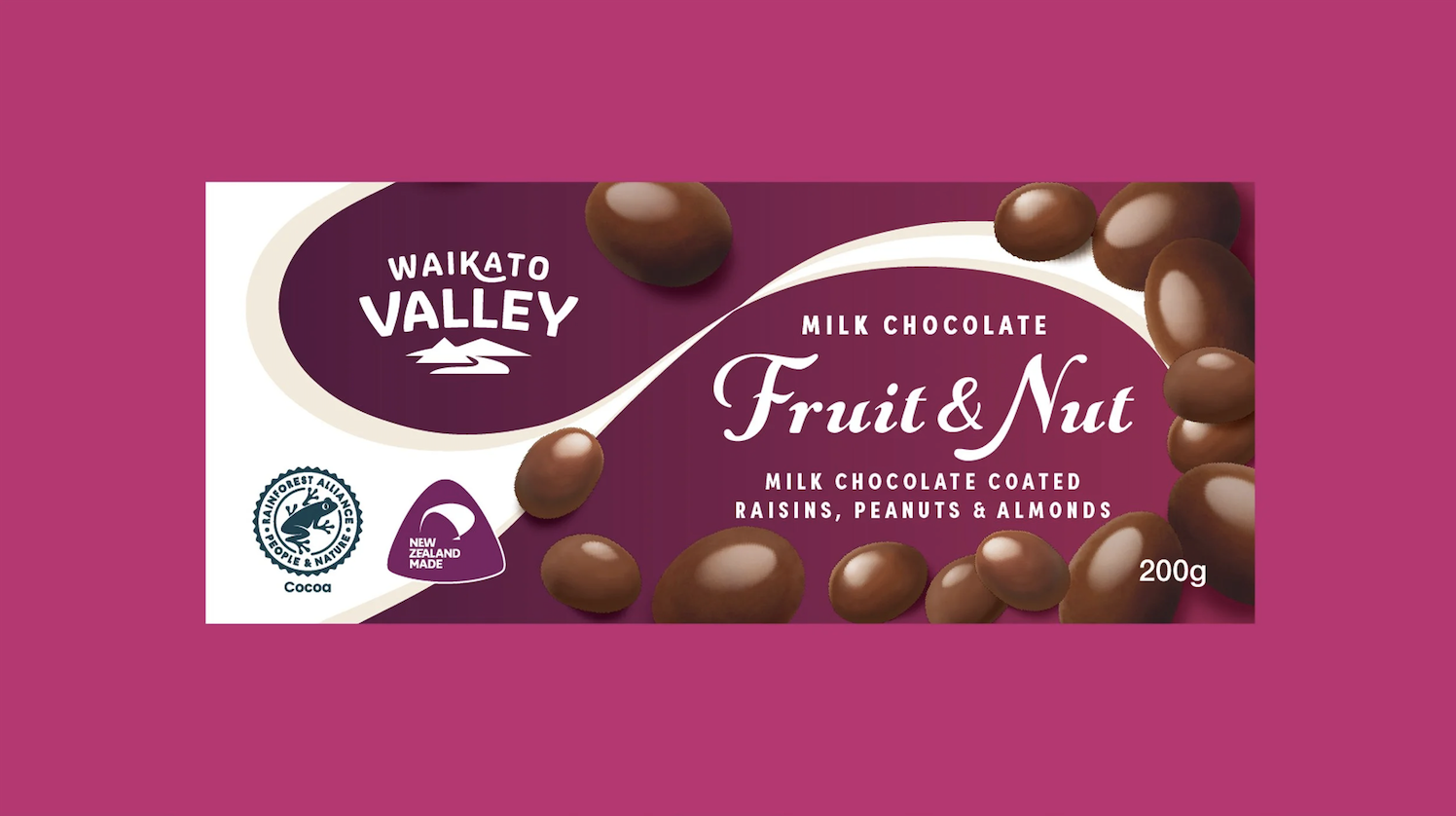
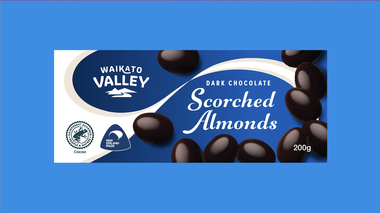
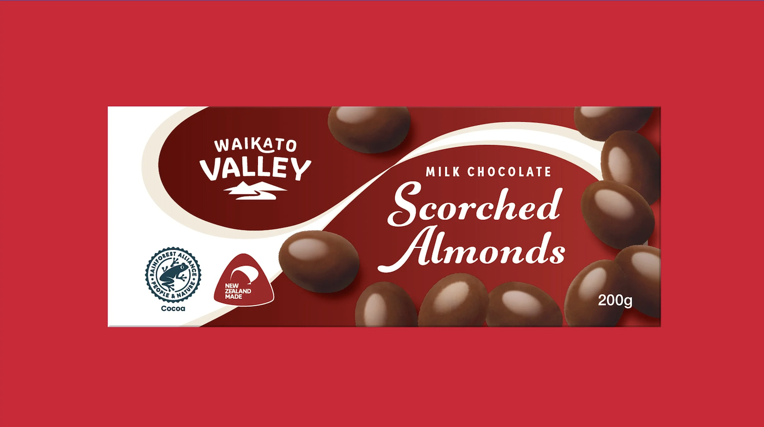
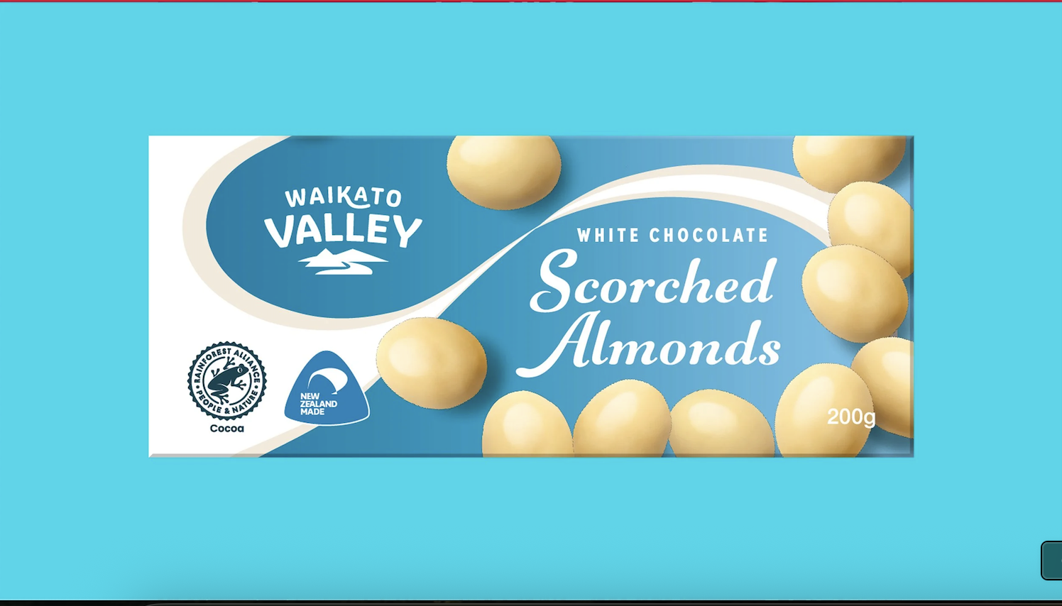
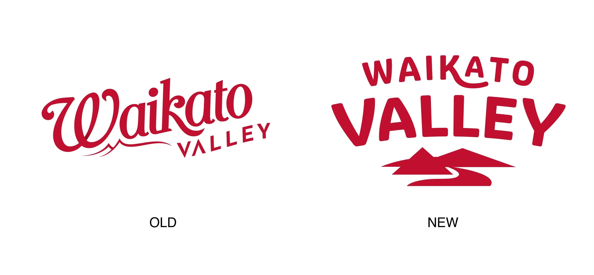
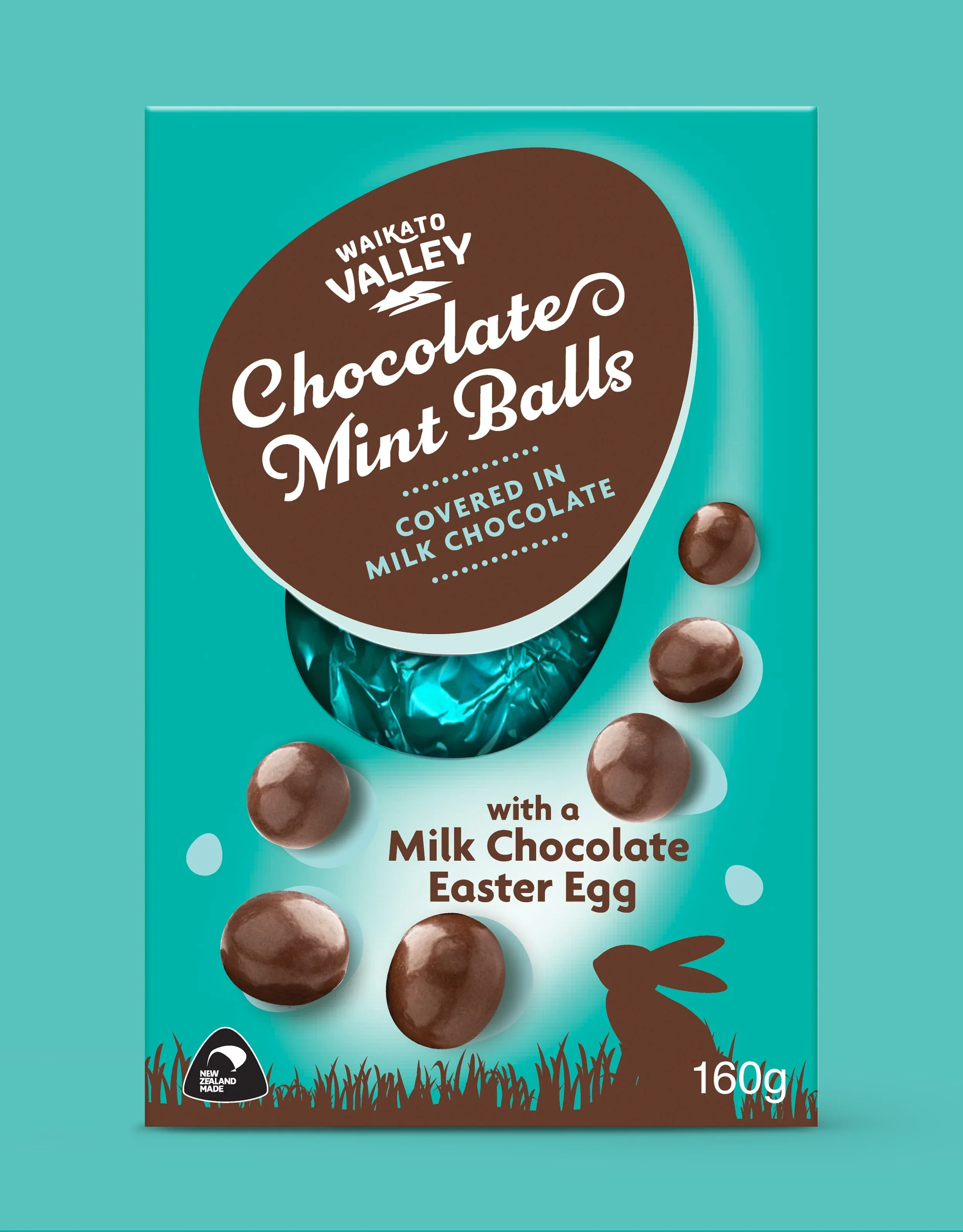
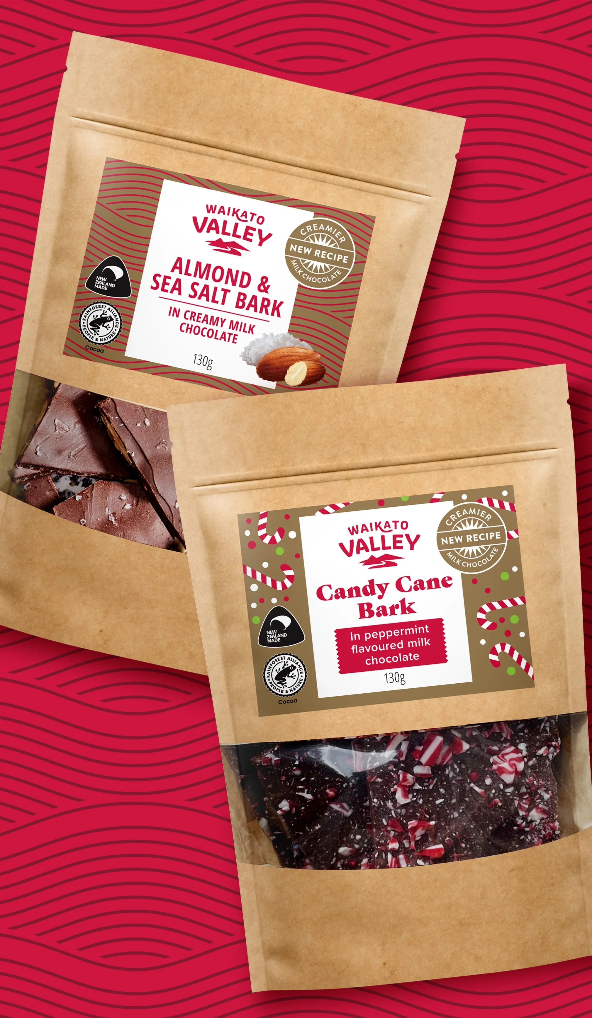
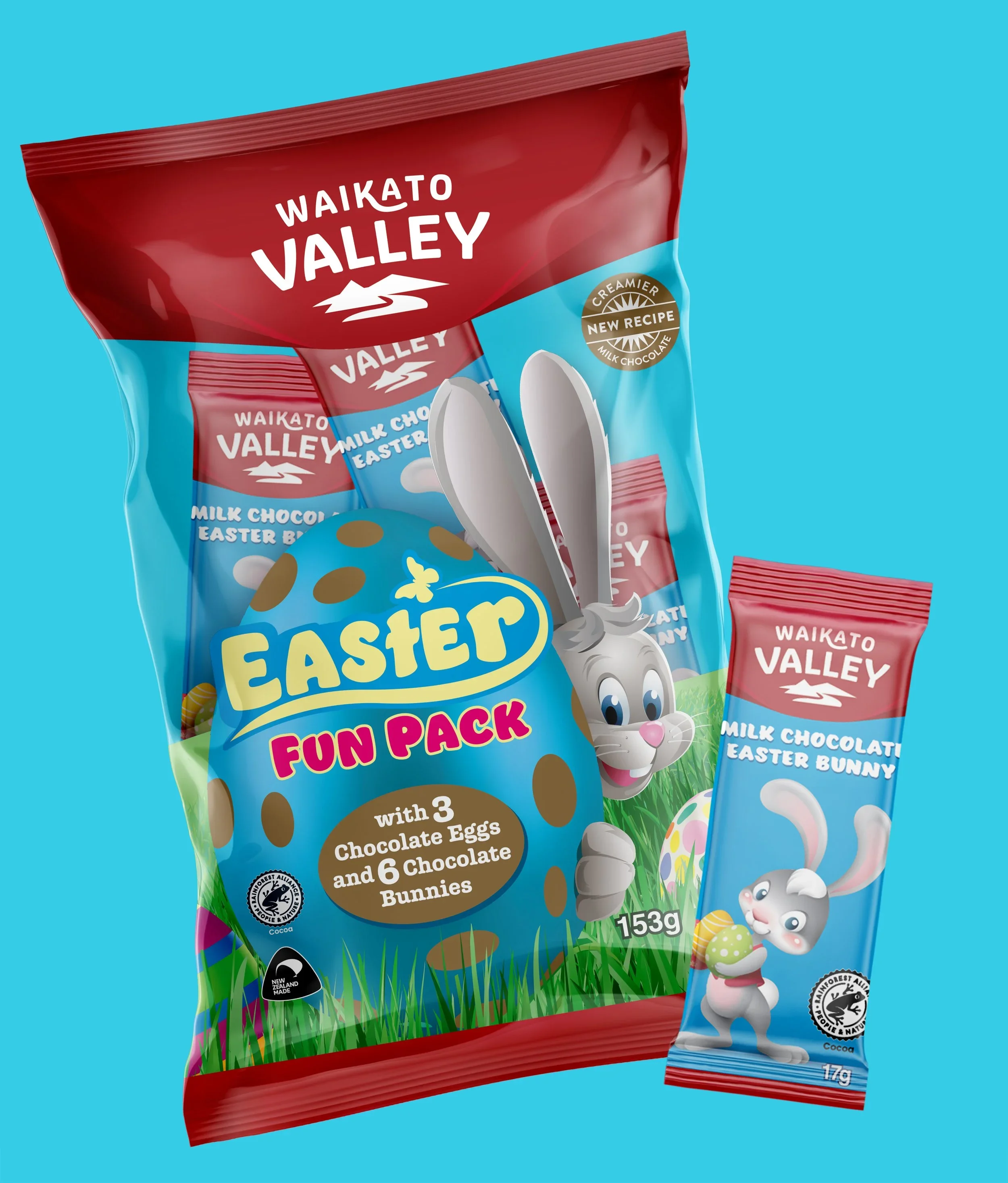
Updating a beloved brand is always a delicate balance — push too far and you lose what people love, don't push far enough and nothing changes. For Waikato Valley Chocolate, the answer was refinement over reinvention. A simplified typographic treatment and a new brand icon brought the identity into the modern era while keeping its New Zealand roots firmly intact, across gifting, Easter and core packaging.
SCOPE: BRAND IDENTITY, PACKAGING DESIGN
*
SCOPE: BRAND IDENTITY, PACKAGING DESIGN *