Work
Three-time Pentawards winner. Kraft, Cadbury, Coca-Cola, Tesco... now working with brands like yours.
Feeding the Cartel with Great Design
*
Feeding the Cartel with Great Design *
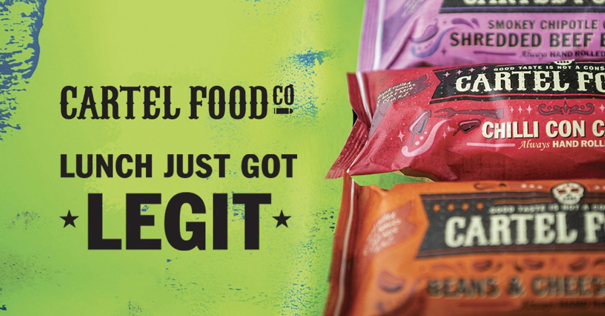
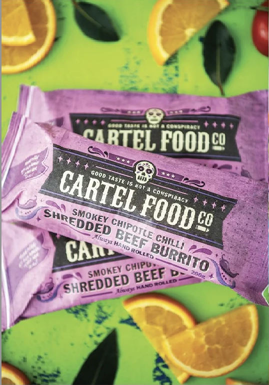
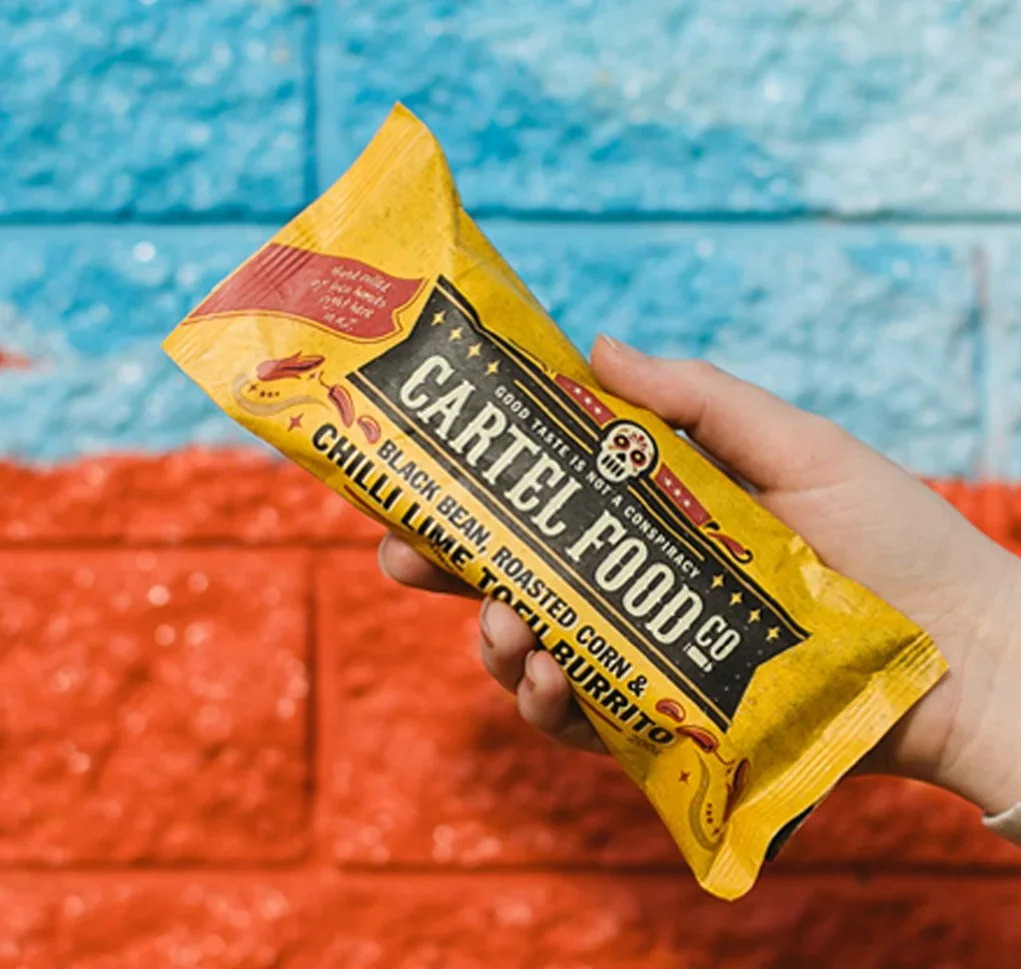
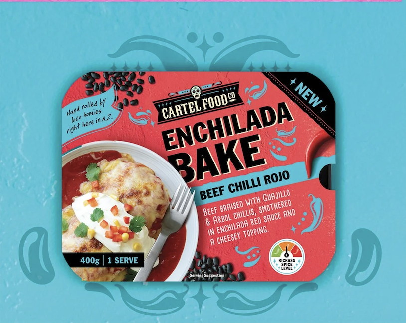
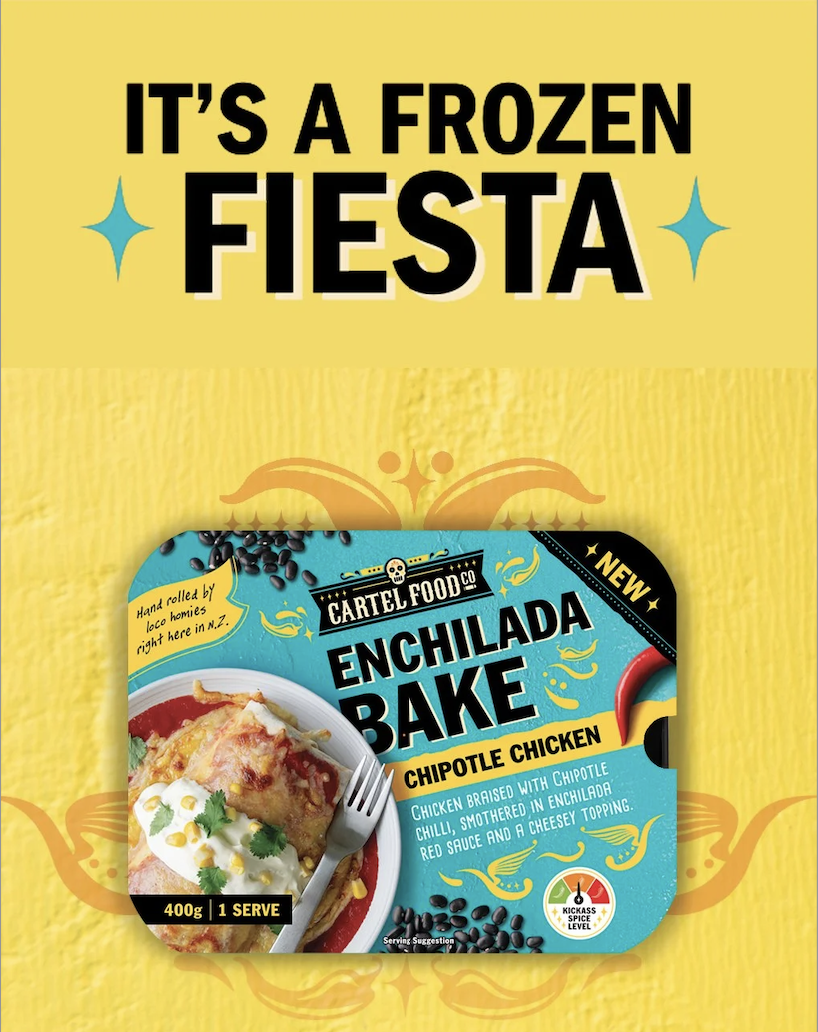
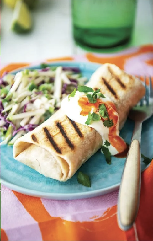
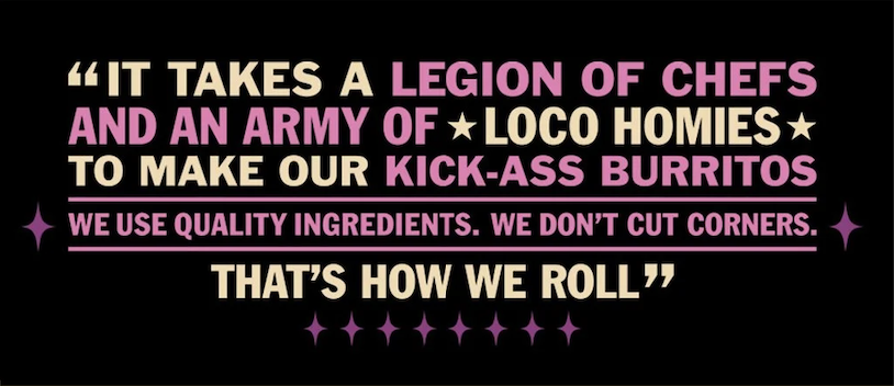
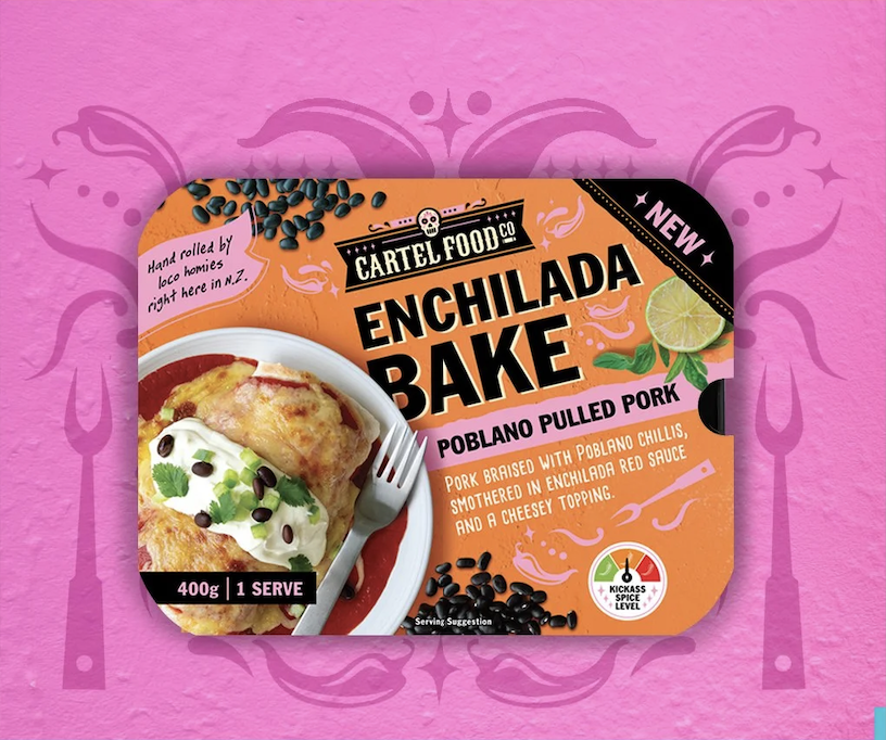
Cartel Food Company makes premium burritos that have no business being in the frozen aisle, and the packaging needed to match that ambition. The brief was to create a brand with genuine edge and personality, one that could cut through a category dominated by predictable photography and safe design choices.
The solution was bold colour, a distinctive illustration style, and language that grabs you before you've even reached for the freezer door. Cartel is well on their way to national burrito domination.
SCOPE: BRAND IDENTITY & PACKAGING DESIGN, ARTWORK PRODUCTION
Neat, Evolved
SCOPE: BRAND IDENTITY & PACKAGING DESIGN, ARTWORK PRODUCTION
Standing out in a crowd is easy for Neat
*
Standing out in a crowd is easy for Neat *
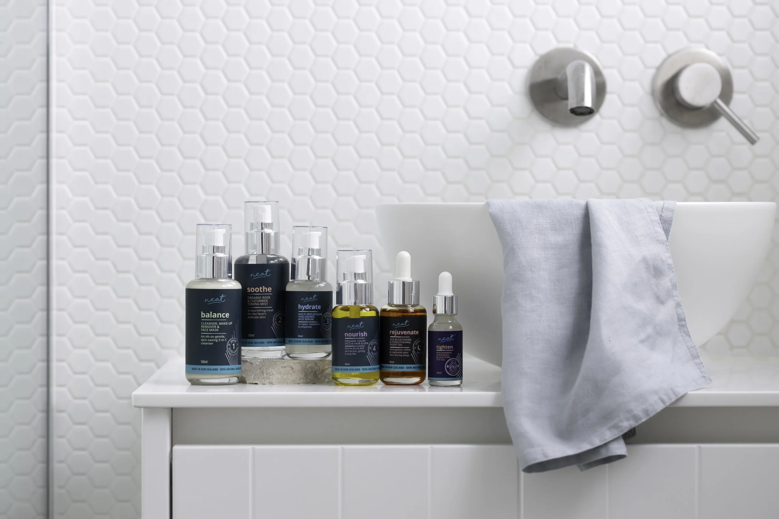
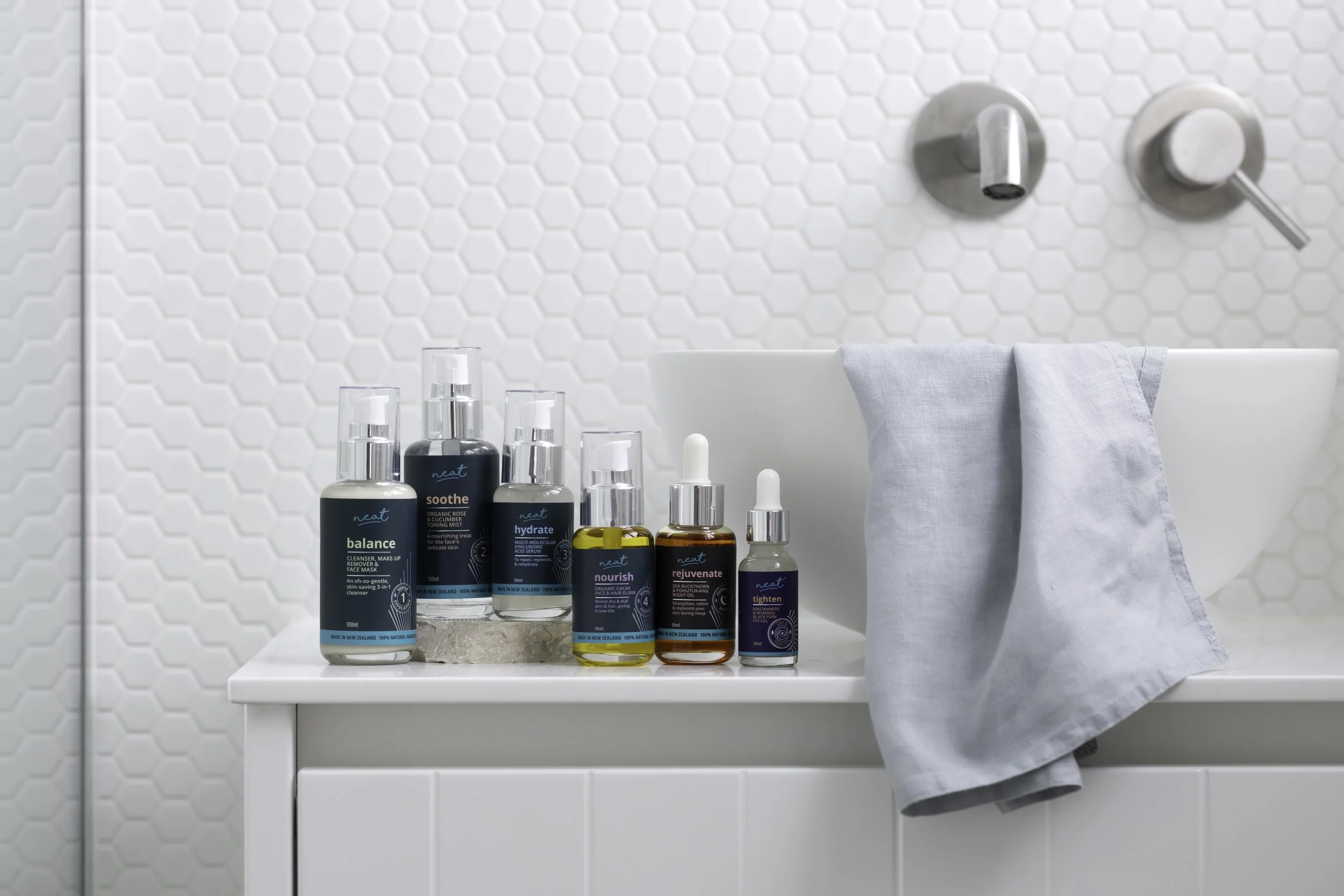
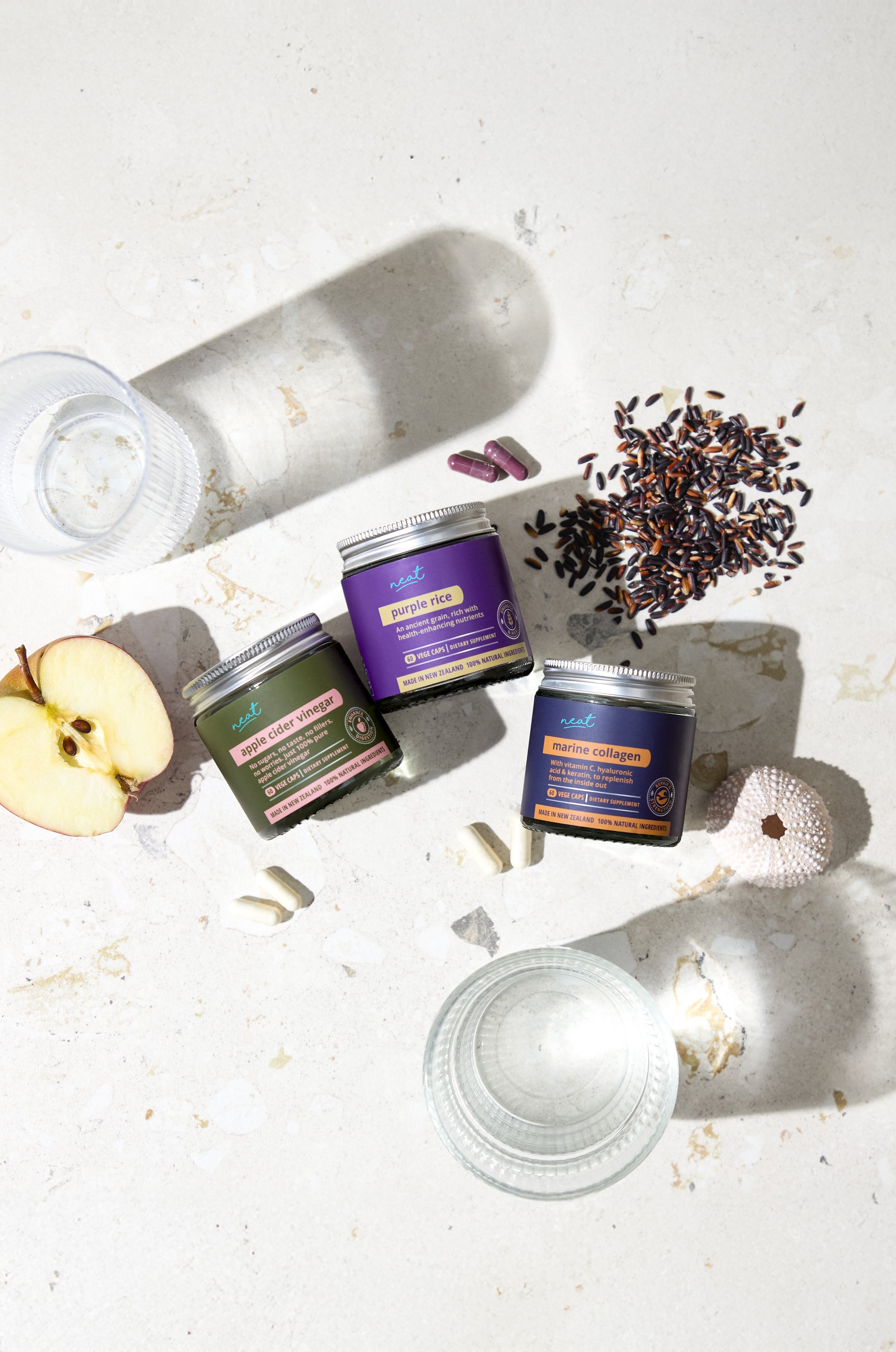
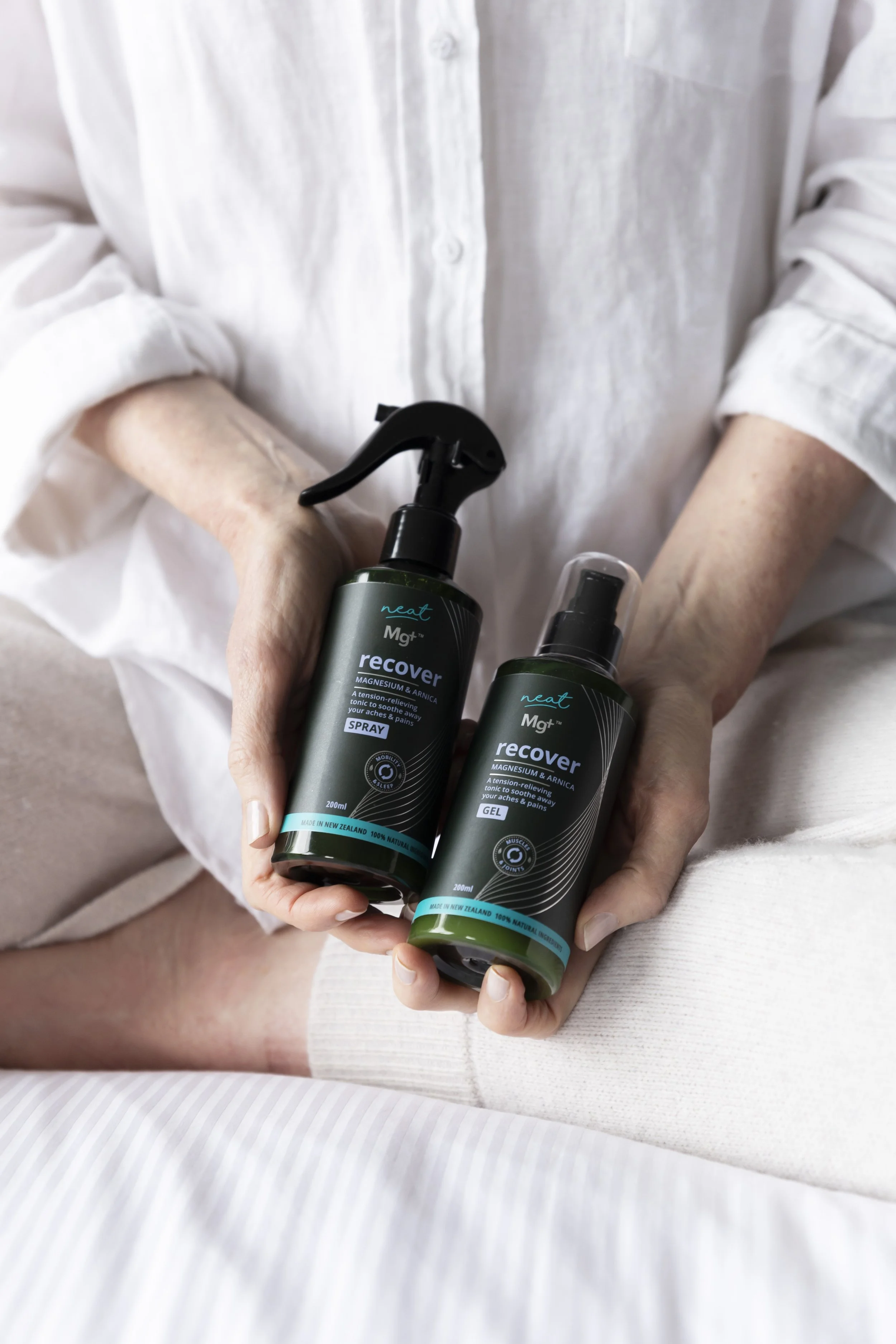
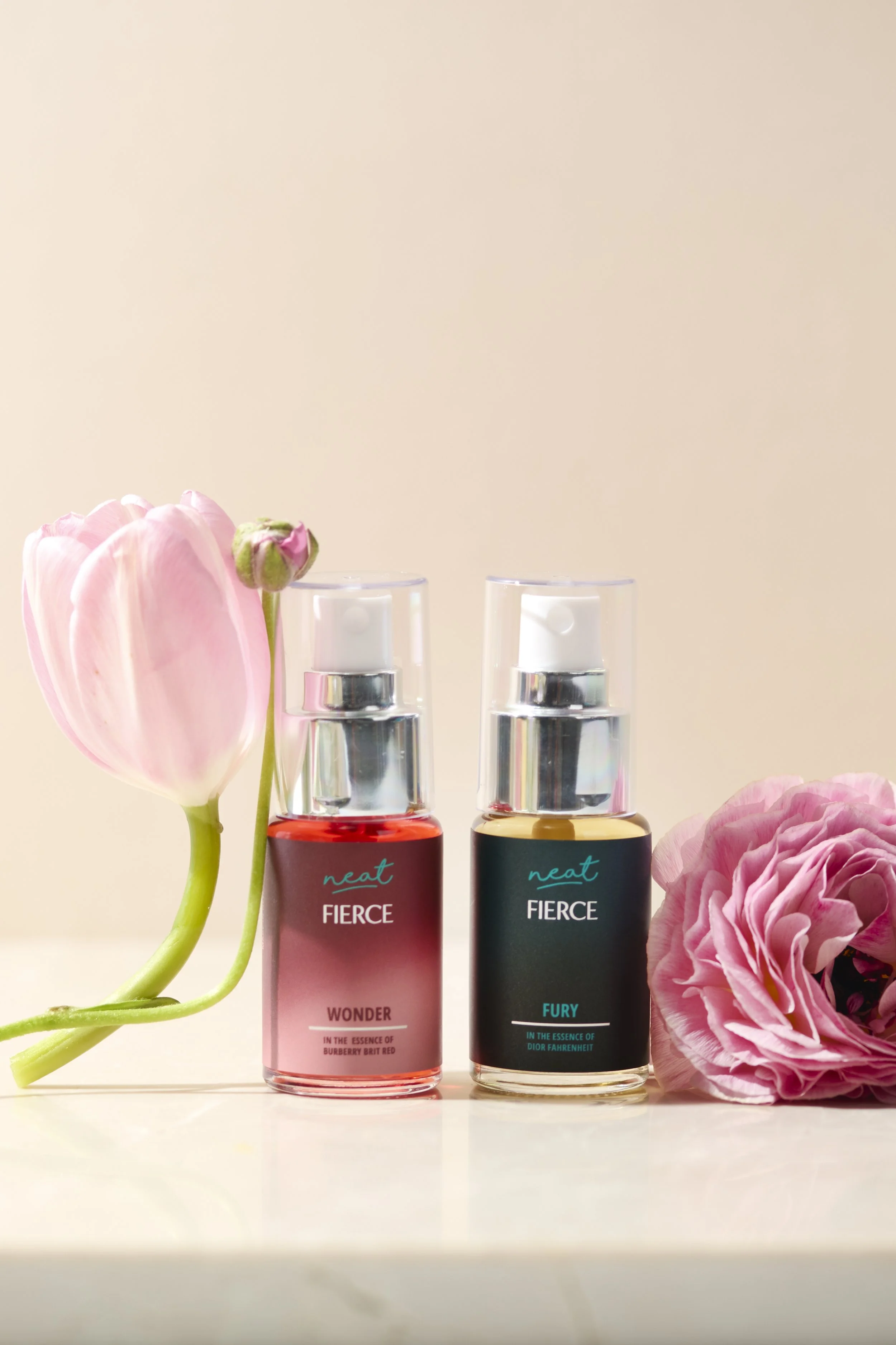
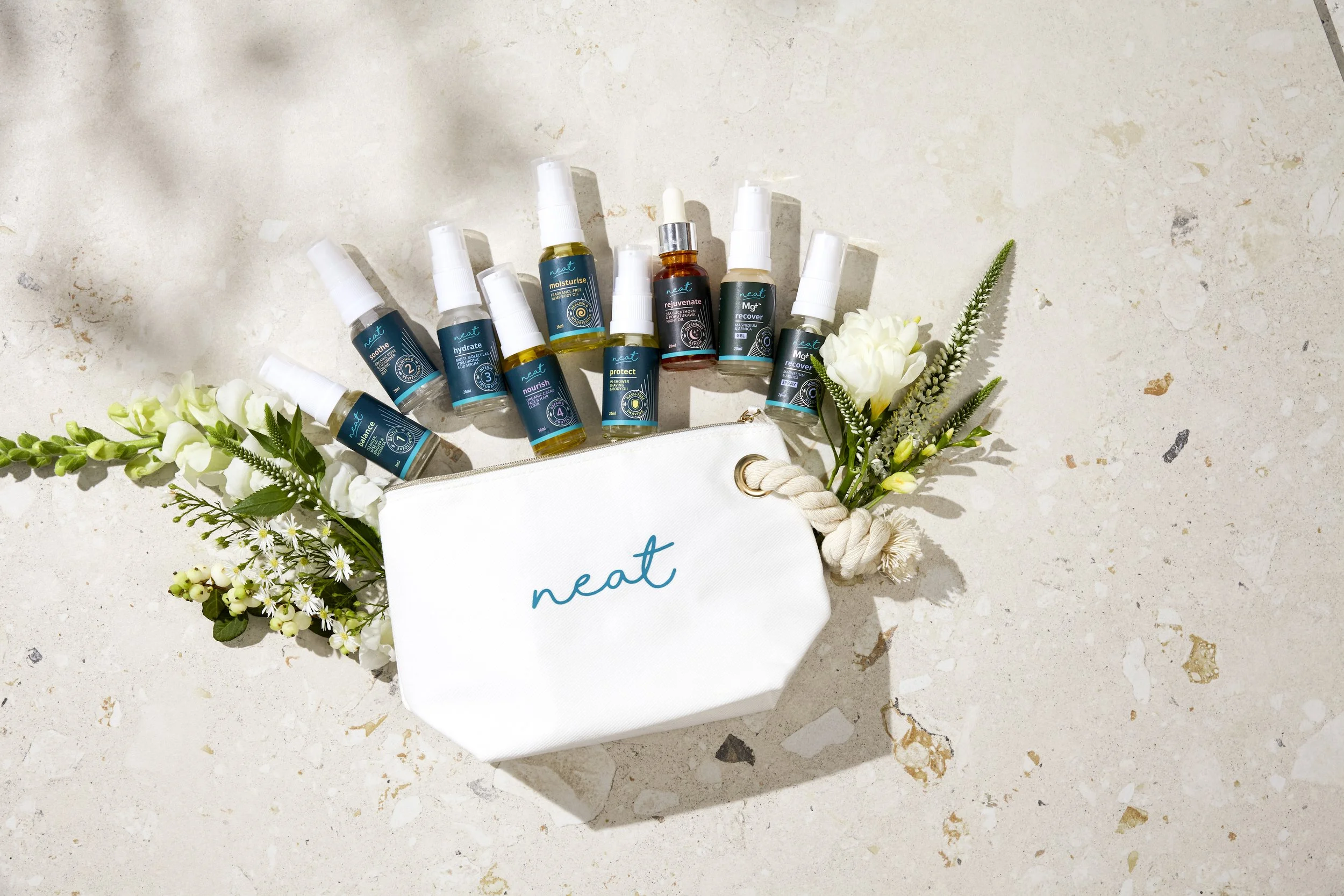
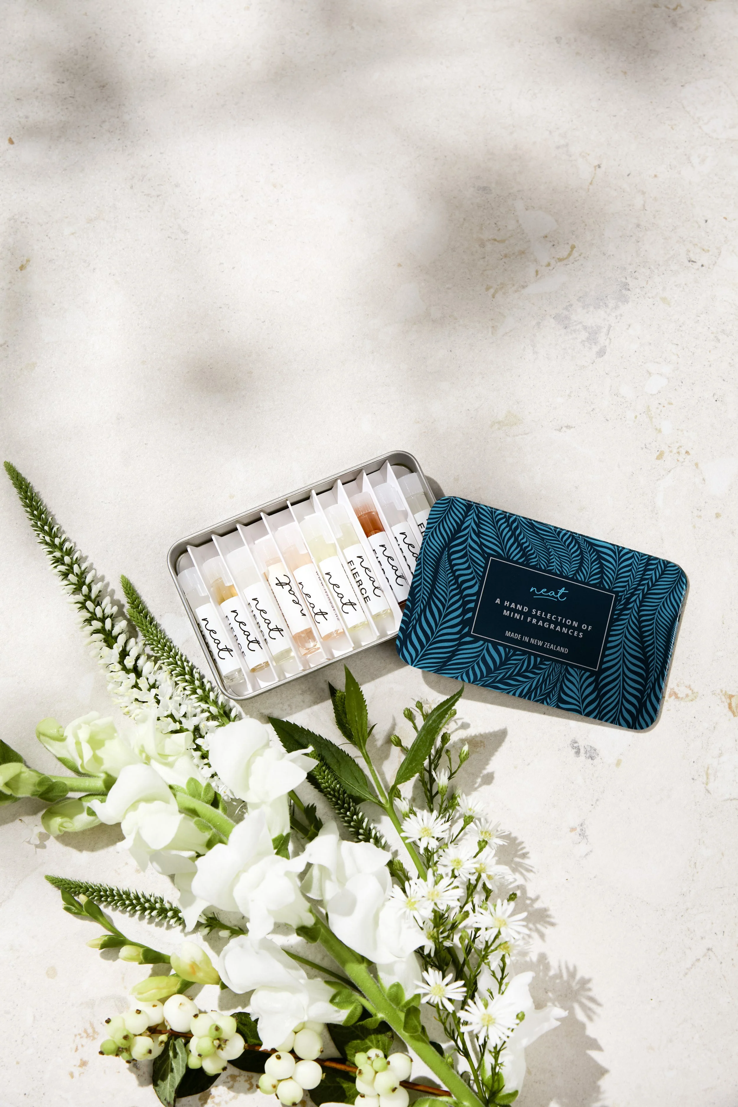
Neat NZ wanted to evolve their skincare and fragrance brand without losing what made it theirs. The challenge was keeping enough familiarity for existing customers while creating something modern enough to last. The result is a timeless design that owns their signature teal palette and caught the attention of a major film production. Their products are set to feature in a globally released movie later this year.
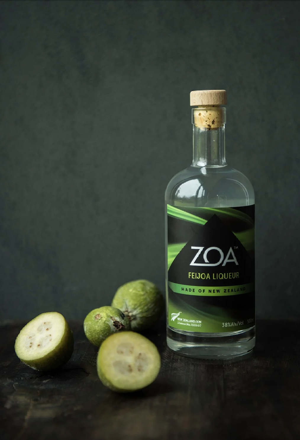
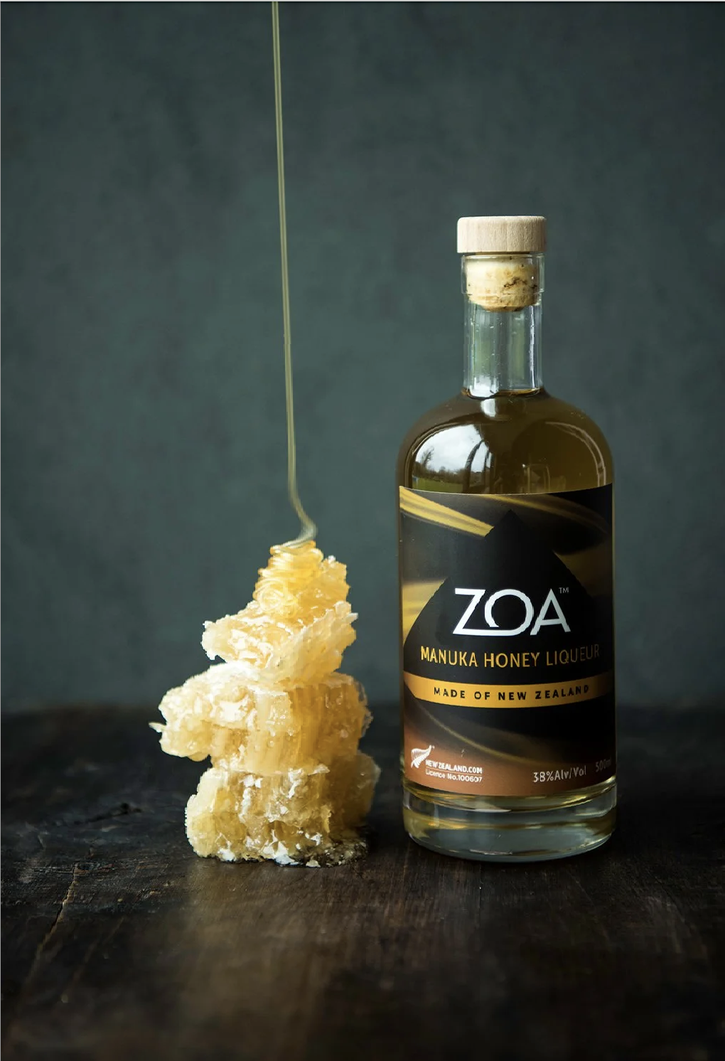
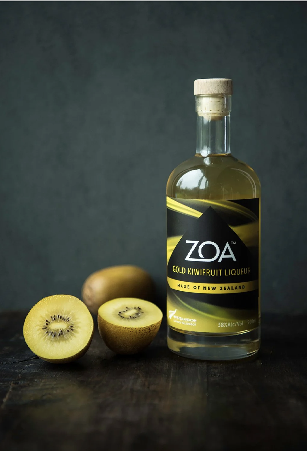
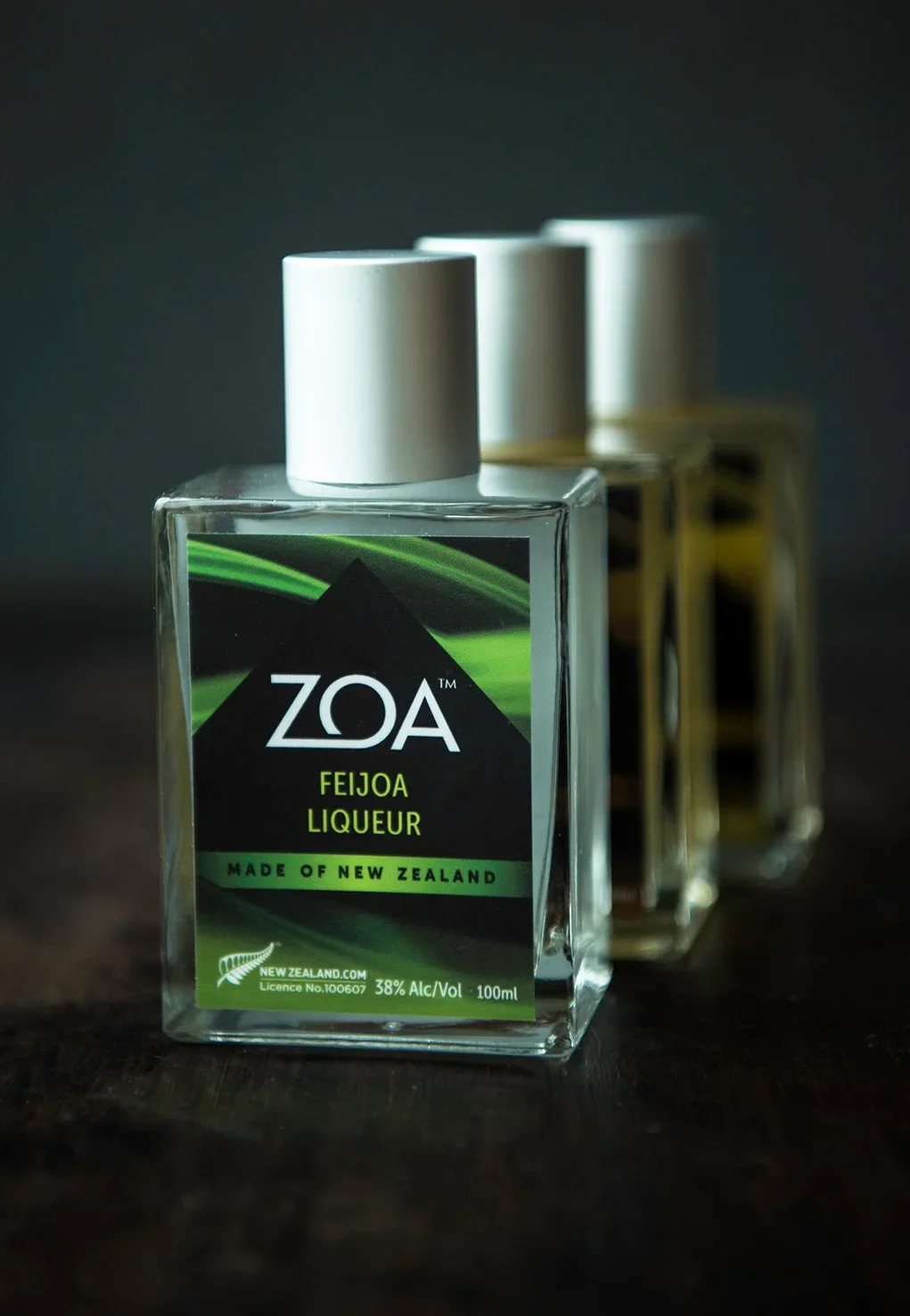
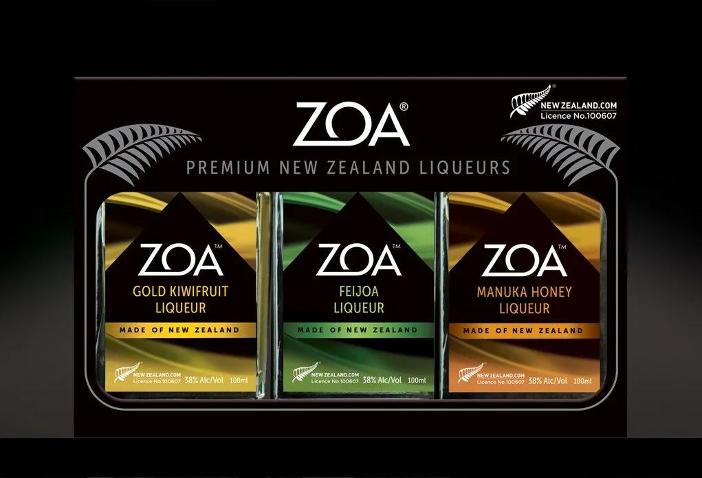
Where the mountain meets the bottle
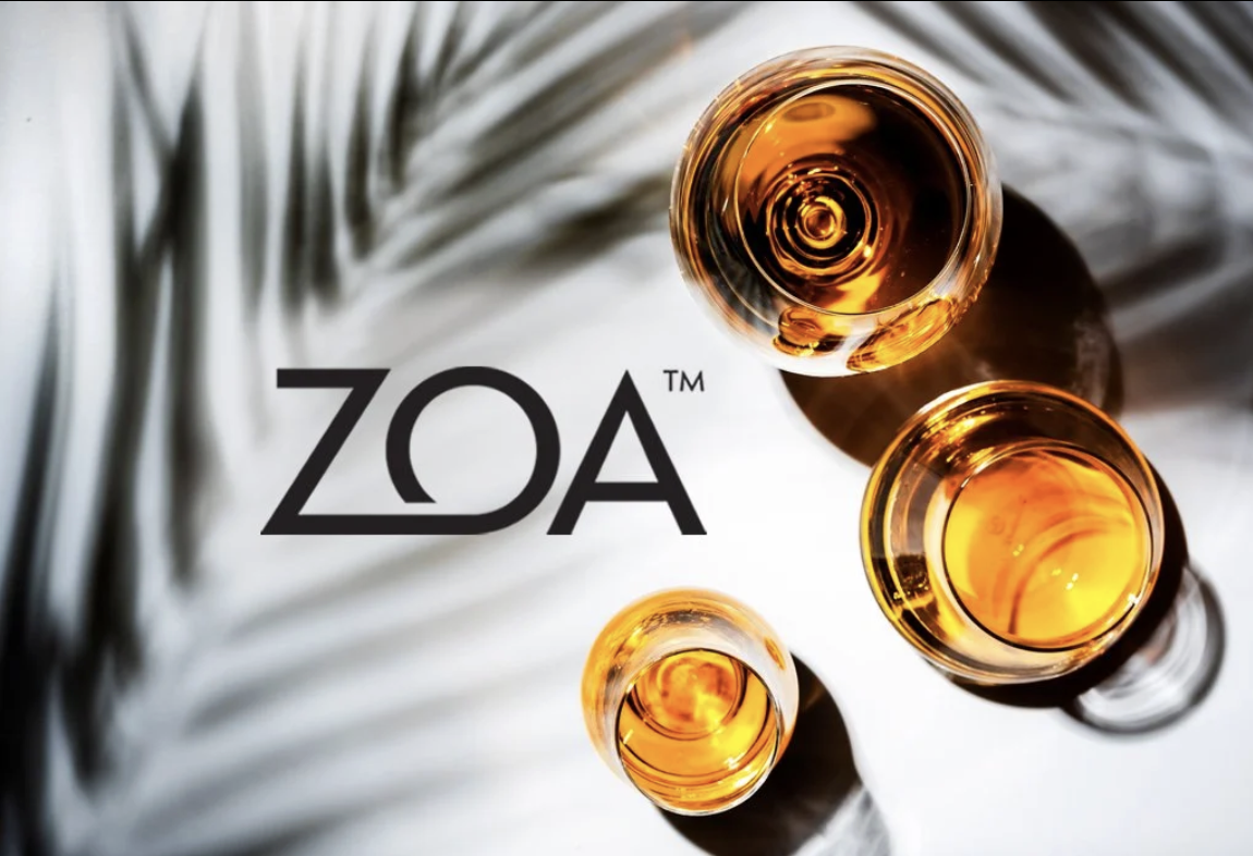
In a liqueur category full of heritage labels and traditional typography, Zoa needed to do something different.
Made from New Zealand ingredients in the village of Inglewood, at the foot of Taranaki Maunga, the product had a story worth telling visually.
The iconic mountain rising through swirling clouds became the centrepiece, capturing the distilling process and the purity of the product in a single, powerful image.
The result is packaging that leaps off the shelf.
Made with intention right down to the label.
SCOPE: BRAND IDENTITY & PACKAGING DESIGN, ARTWORK PRODUCTION
Speaking of Bold Flavours
*
Let's get Spicy!
*
Speaking of Bold Flavours * Let's get Spicy! *
SCOPE: BRAND STRATEGY, BRAND IDENTITY, PACKAGING DESIGN, NAMING, BRAND TONE OF VOICE, DIGITAL BRAND ASSETS, ARTWORK PRODUCTION
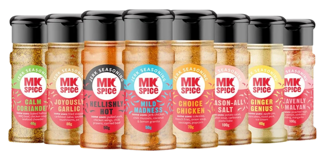
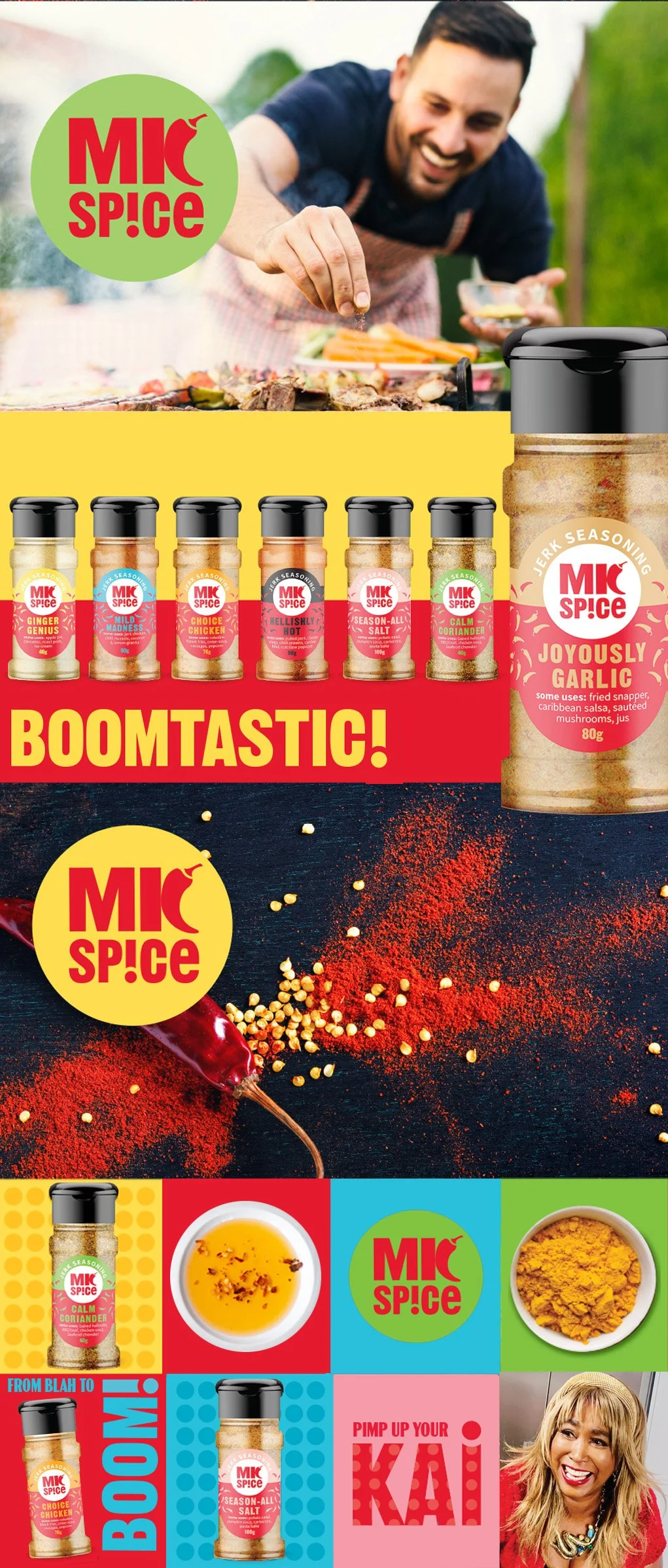
When TV host, actor and entrepreneur Marlaina Curtis rebranded her jerk spice and oil range, she needed more than a new look, she needed packaging that felt like her.
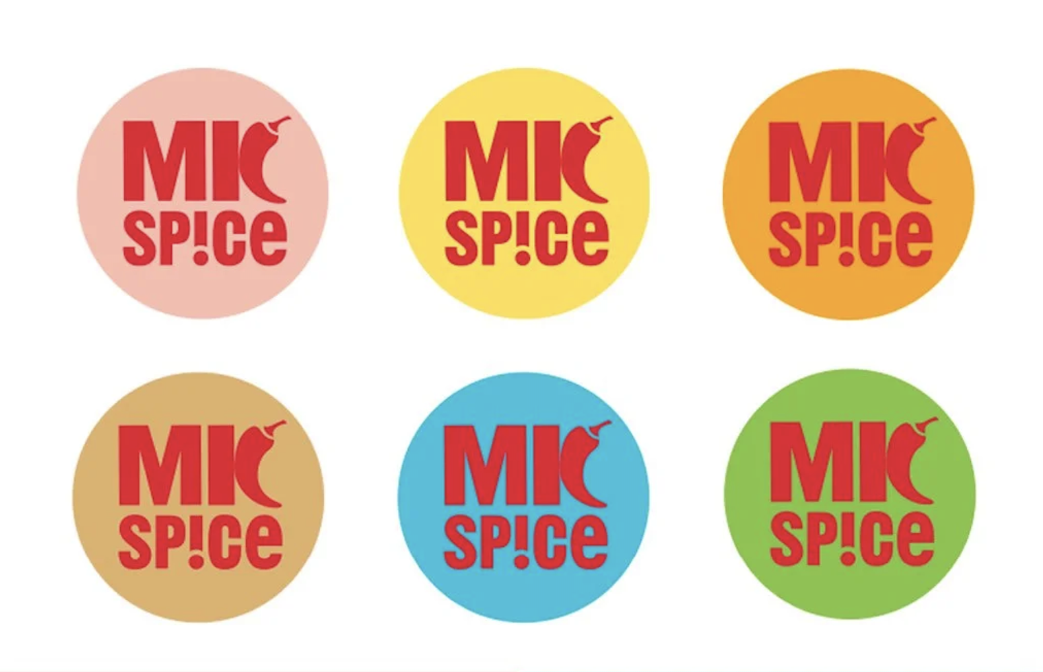
The rebrand leans fully into Marlaina's personality. Vibrant colour, bold language and a graphic system flexible enough to work across the entire range. Consistency was key, but so was character. Even the product names deliver on both: Mild Madness and Joyously Garlic are impossible to forget.
Like what you see..?
Design So Good You Can Taste It!!
*
Design So Good You Can Taste It!! *
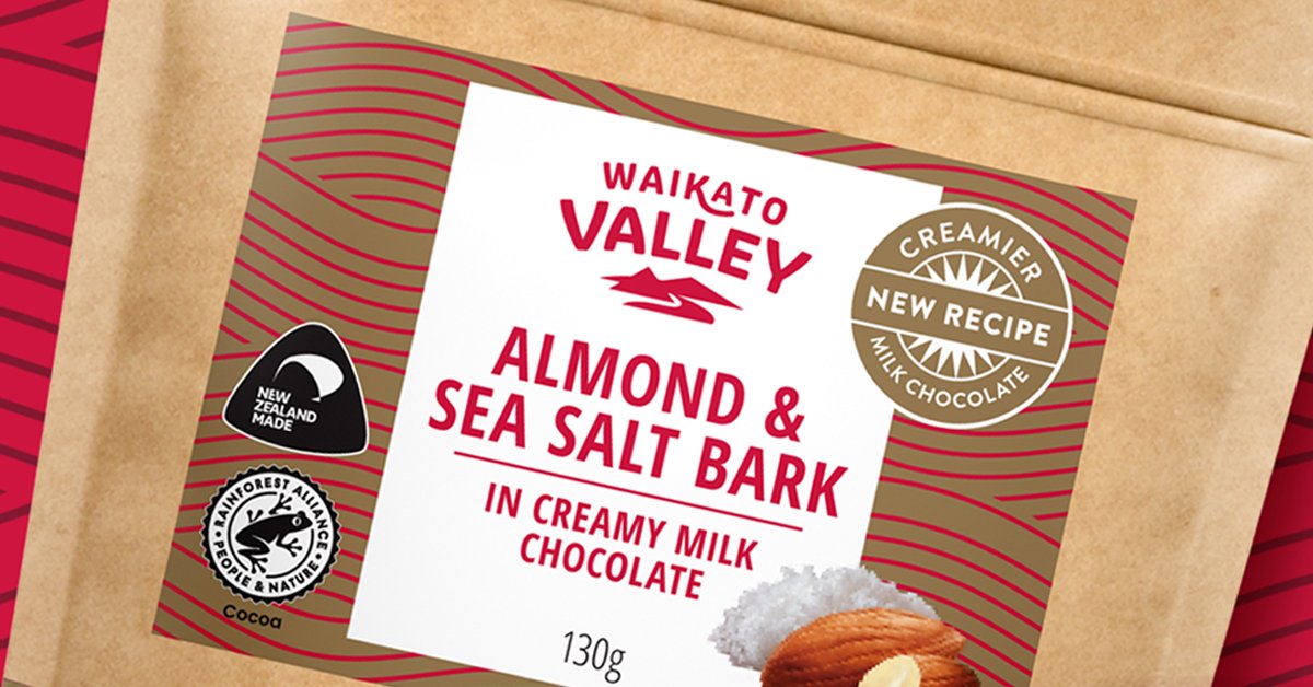
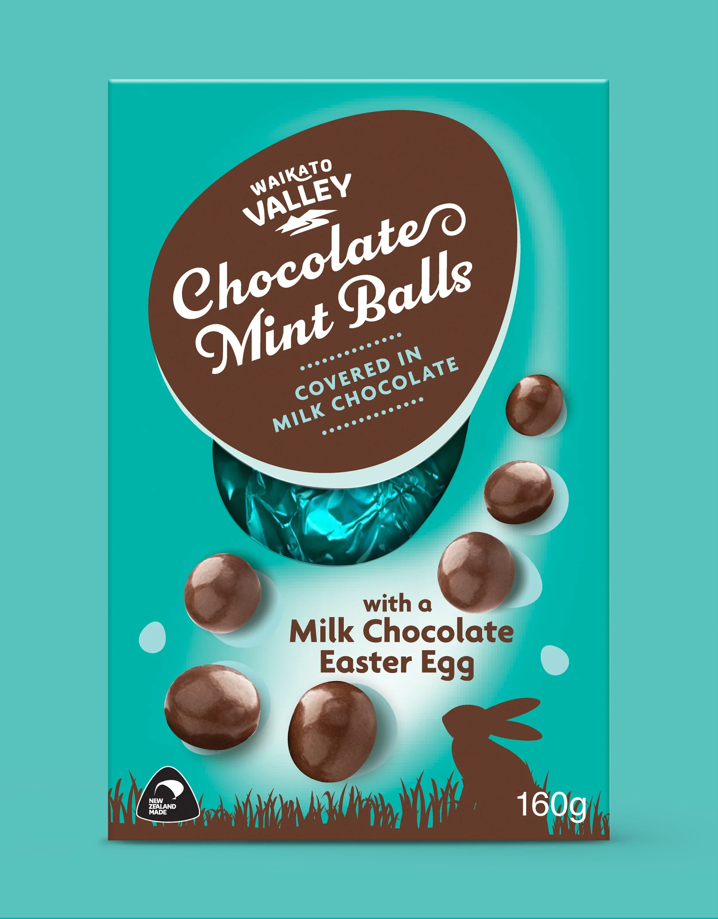
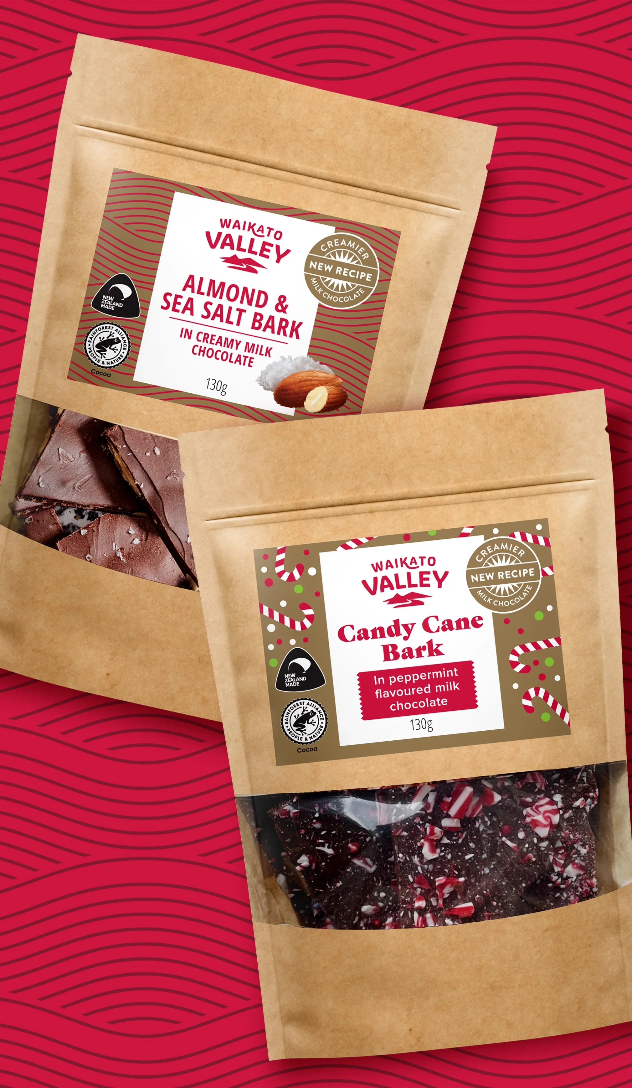
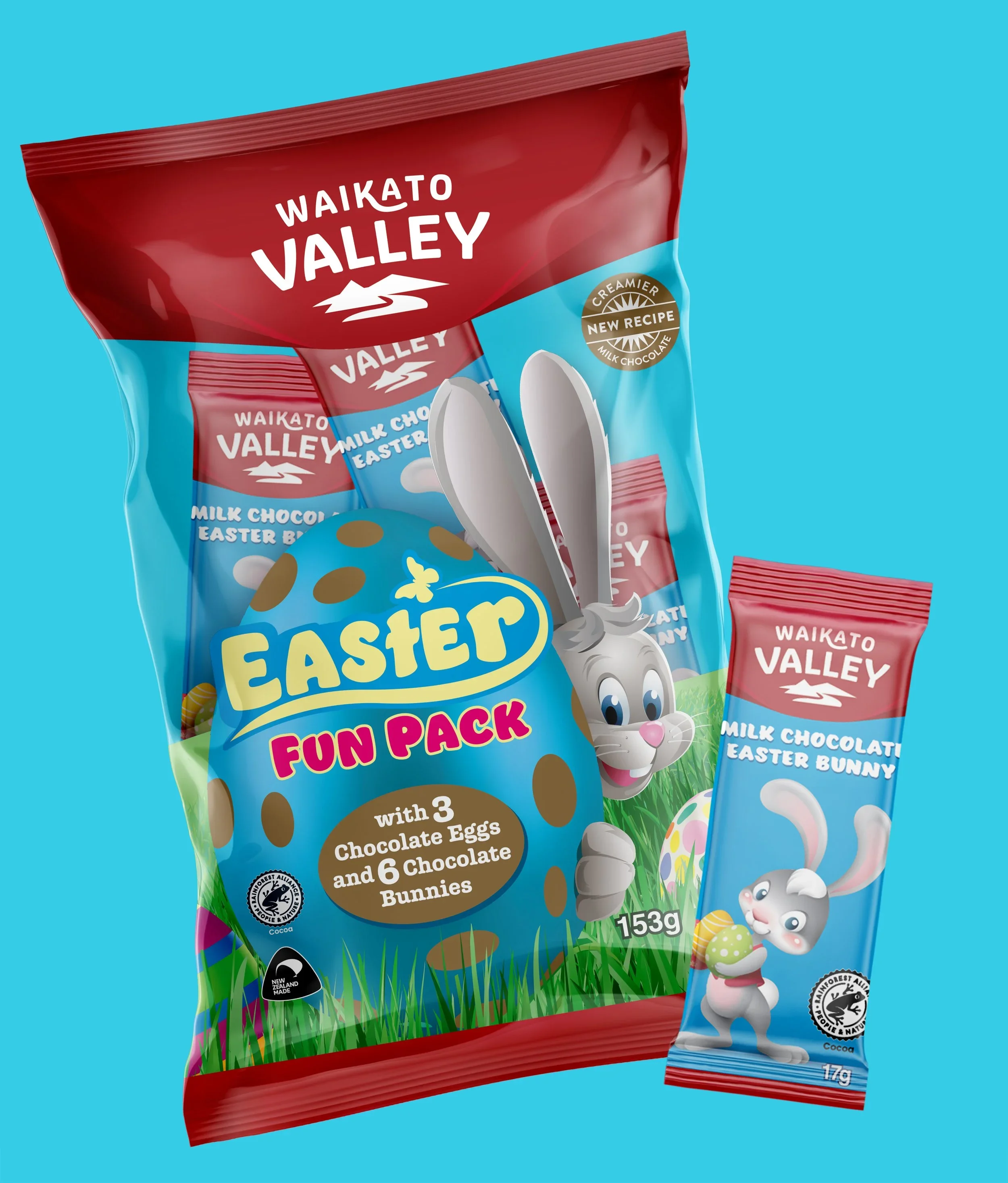
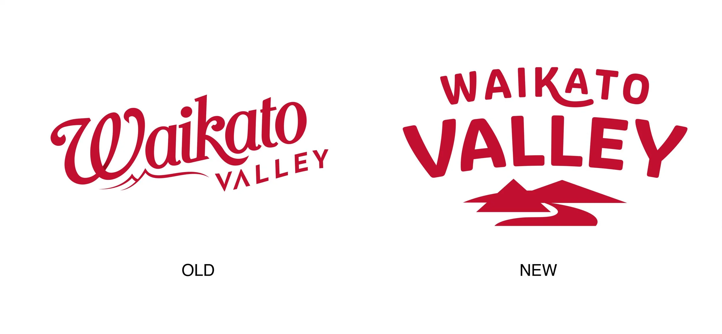
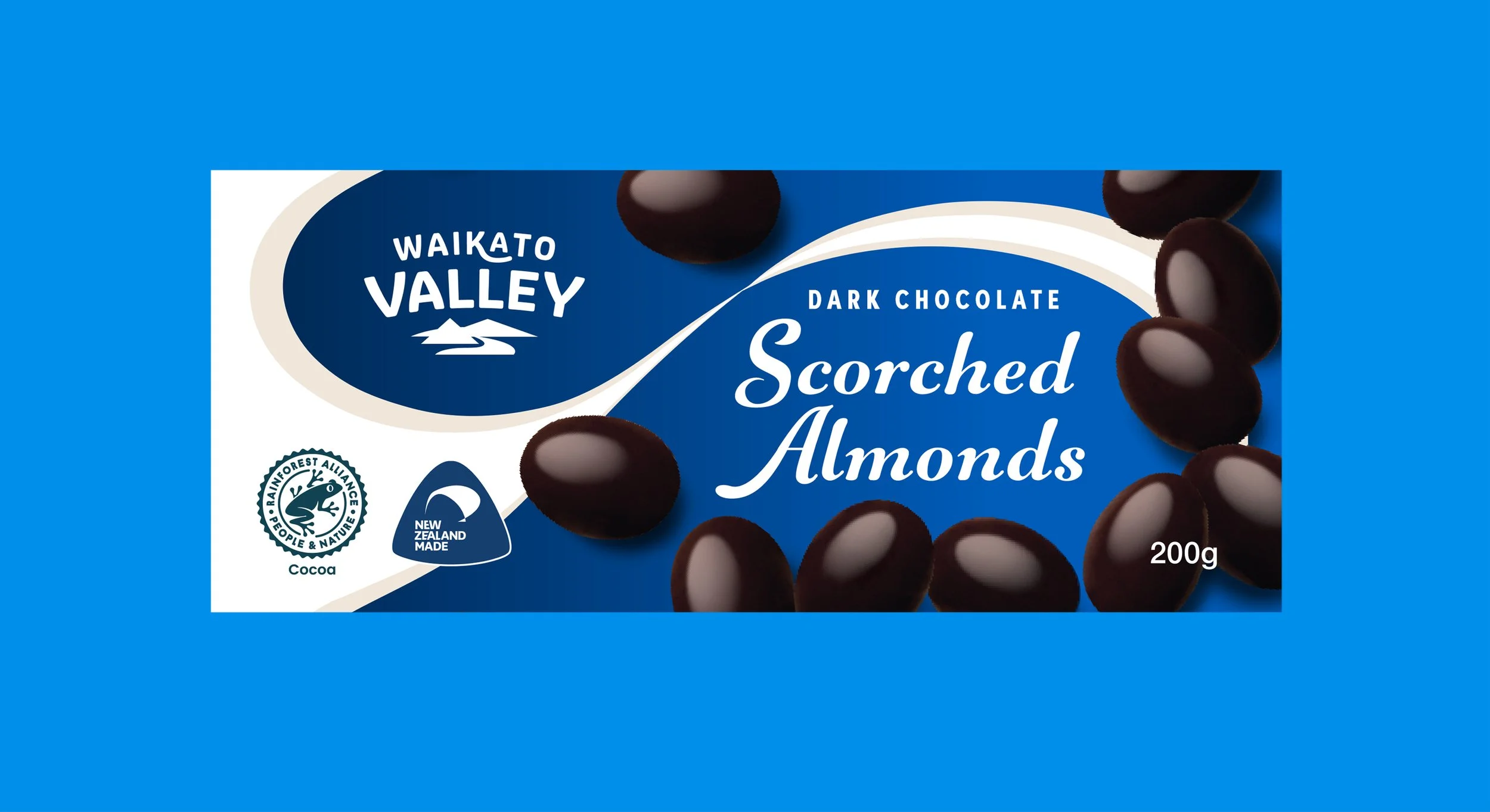
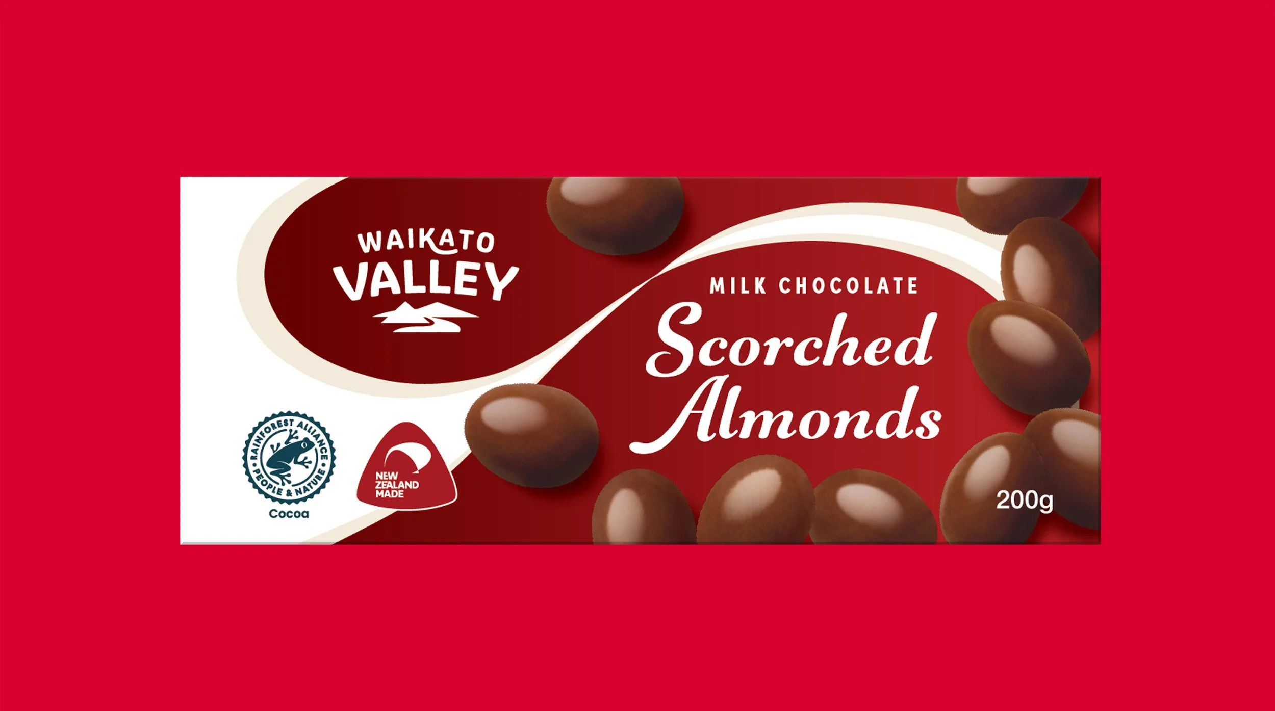
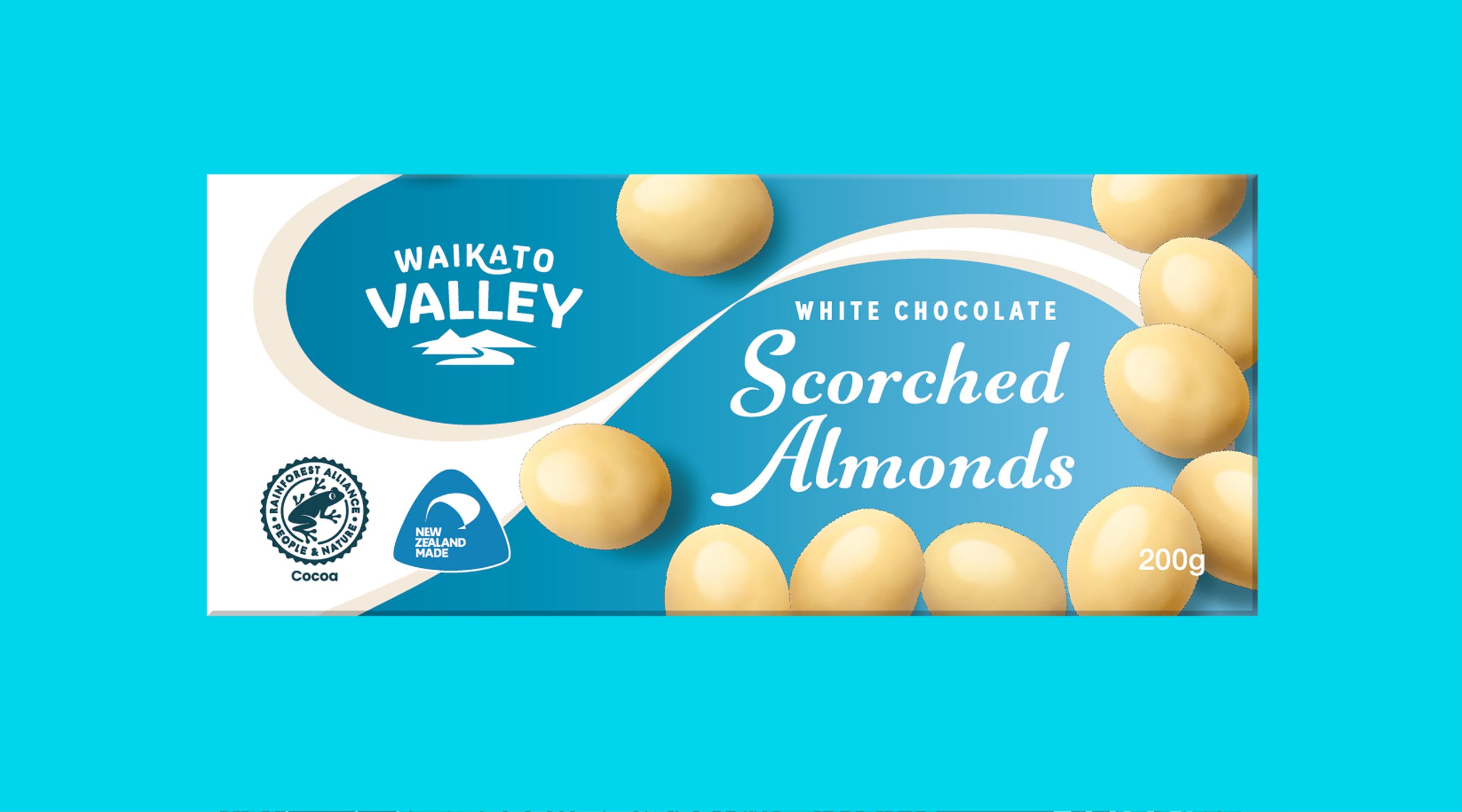
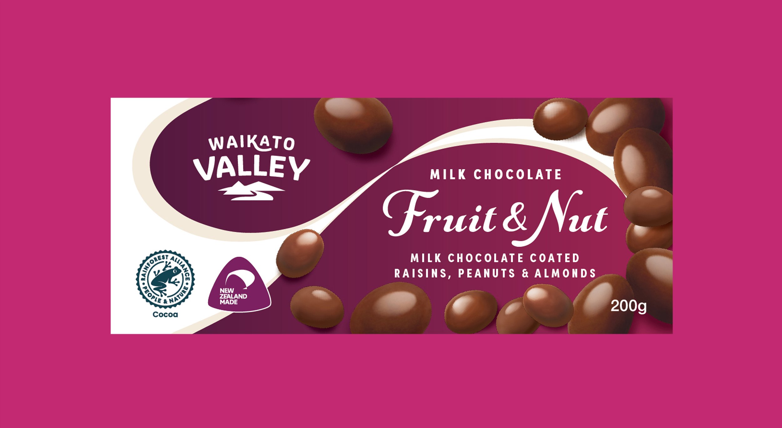
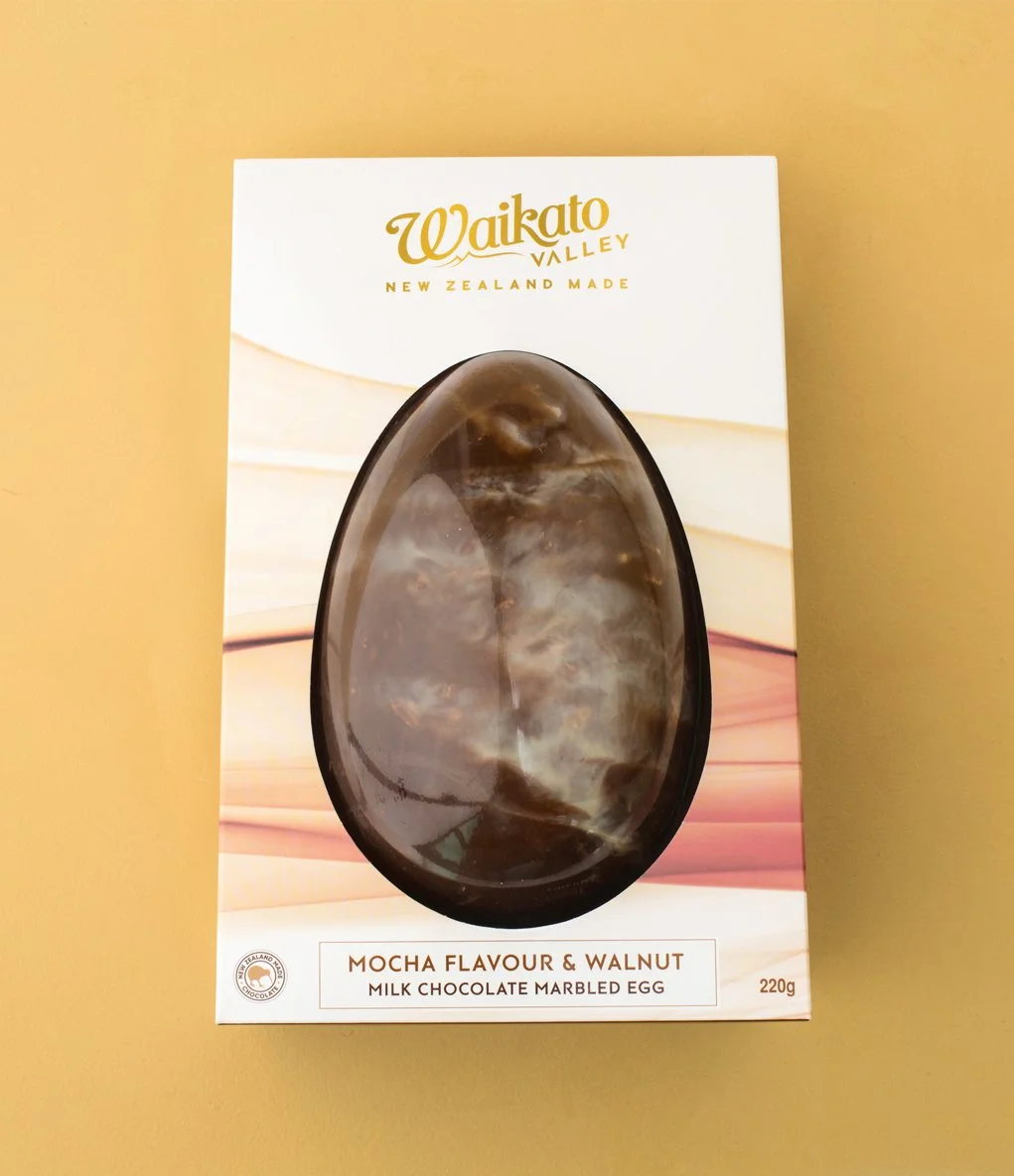
Updating a beloved brand is always a delicate balance. Push too far and you lose what people love, don't push far enough and nothing changes. For Waikato Valley Chocolate, the answer was refinement over reinvention. A simplified typographic treatment and a new brand icon brought the identity into the modern era while keeping its New Zealand roots firmly intact, across gifting, Easter and core packaging.
SCOPE: BRAND IDENTITY, PACKAGING DESIGN
*
SCOPE: BRAND IDENTITY, PACKAGING DESIGN *
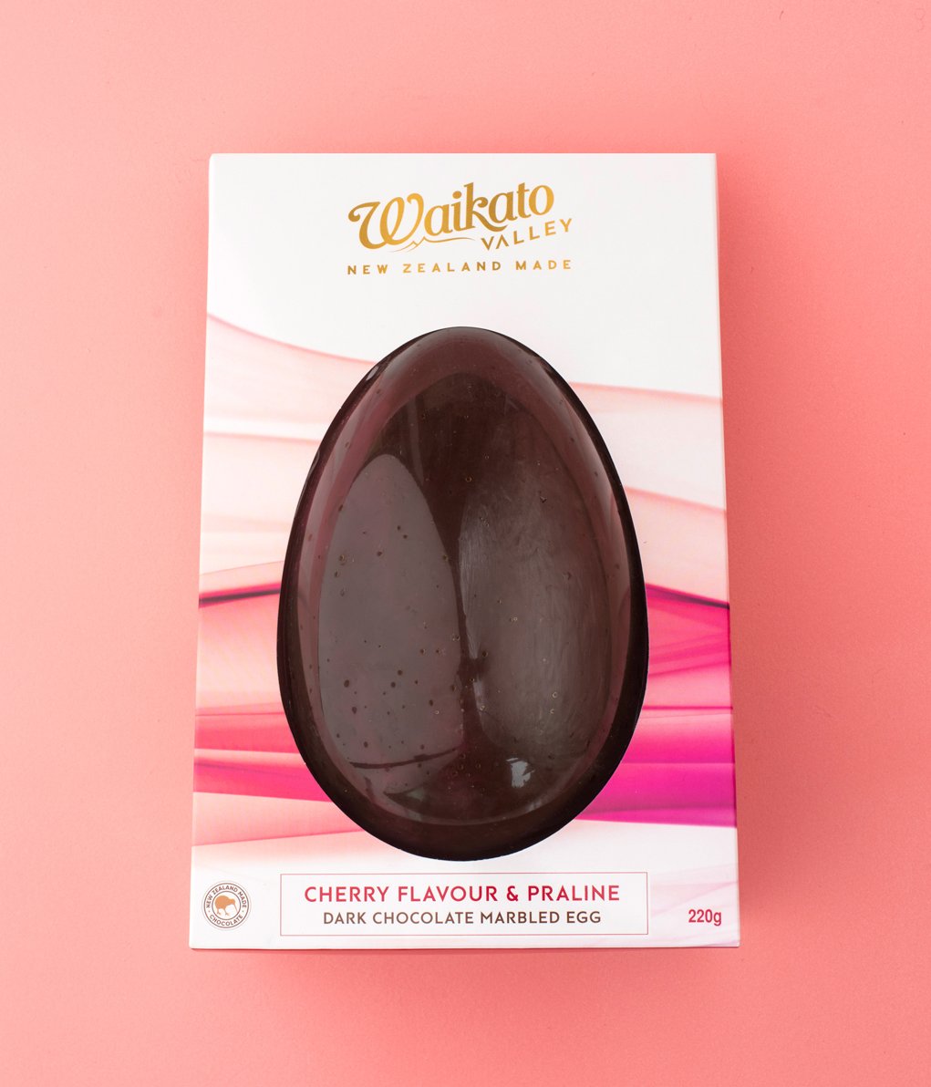
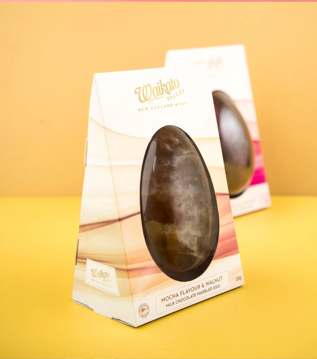
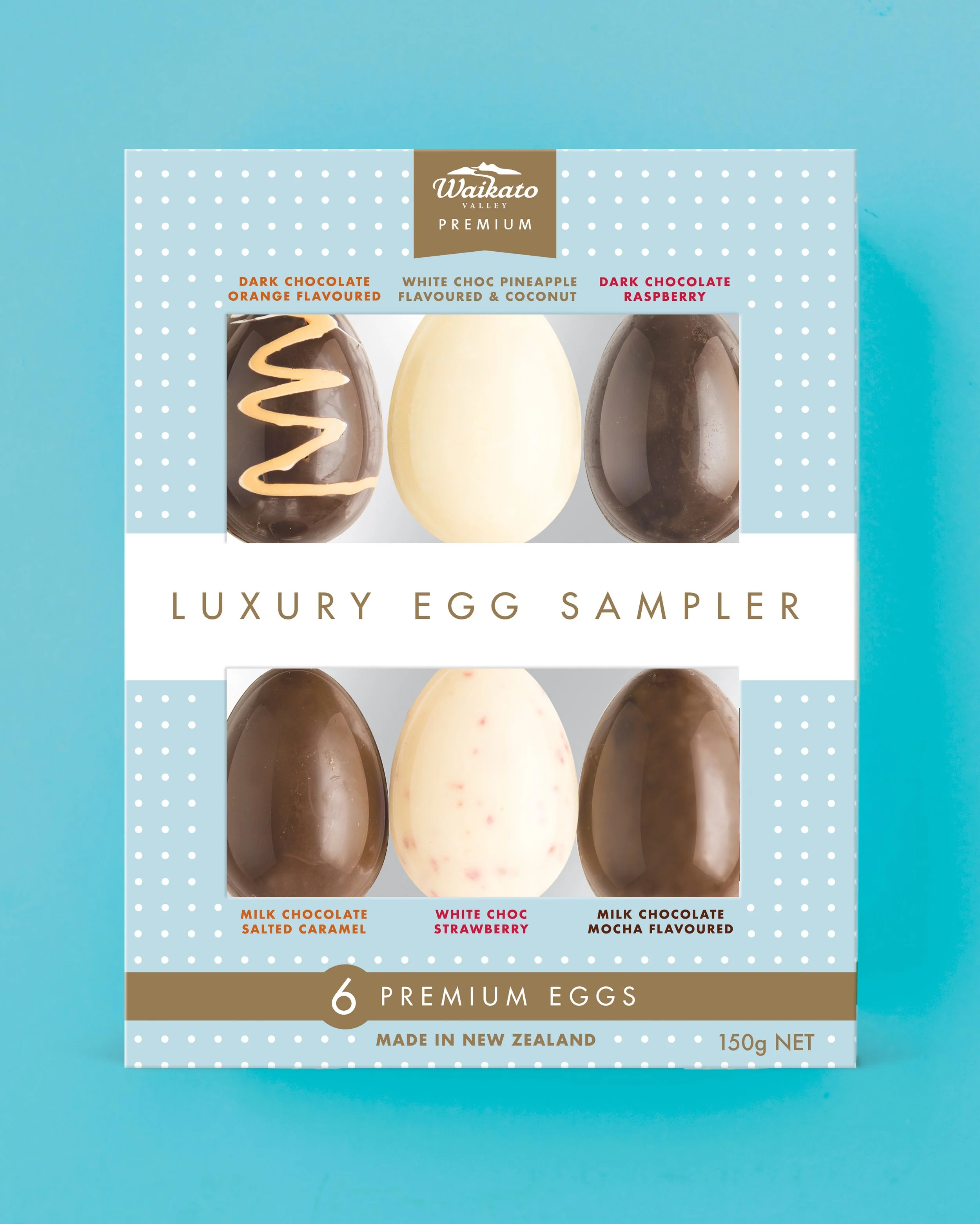
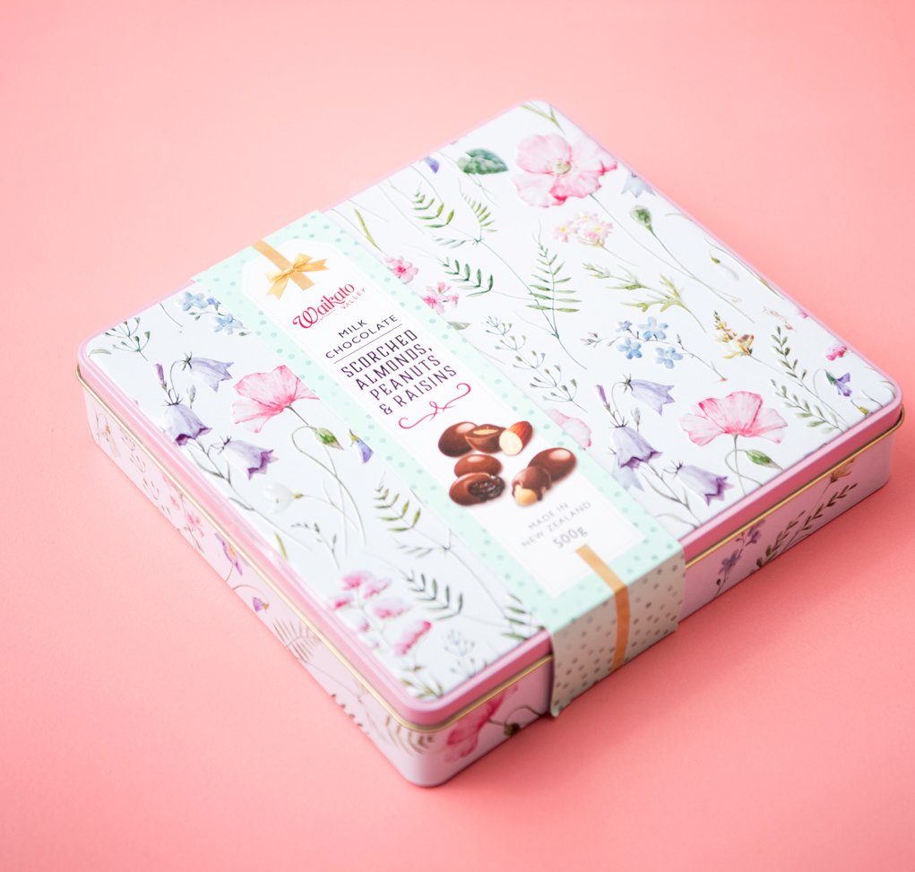
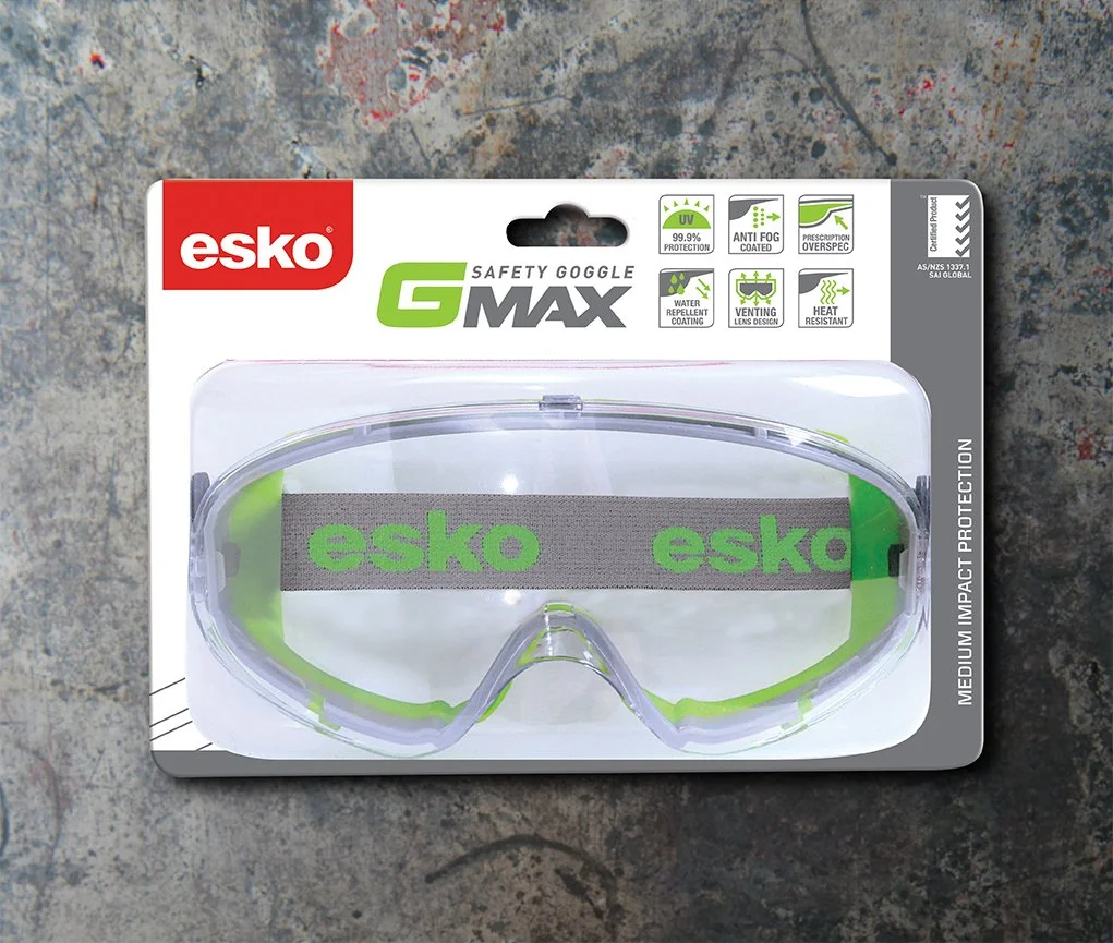
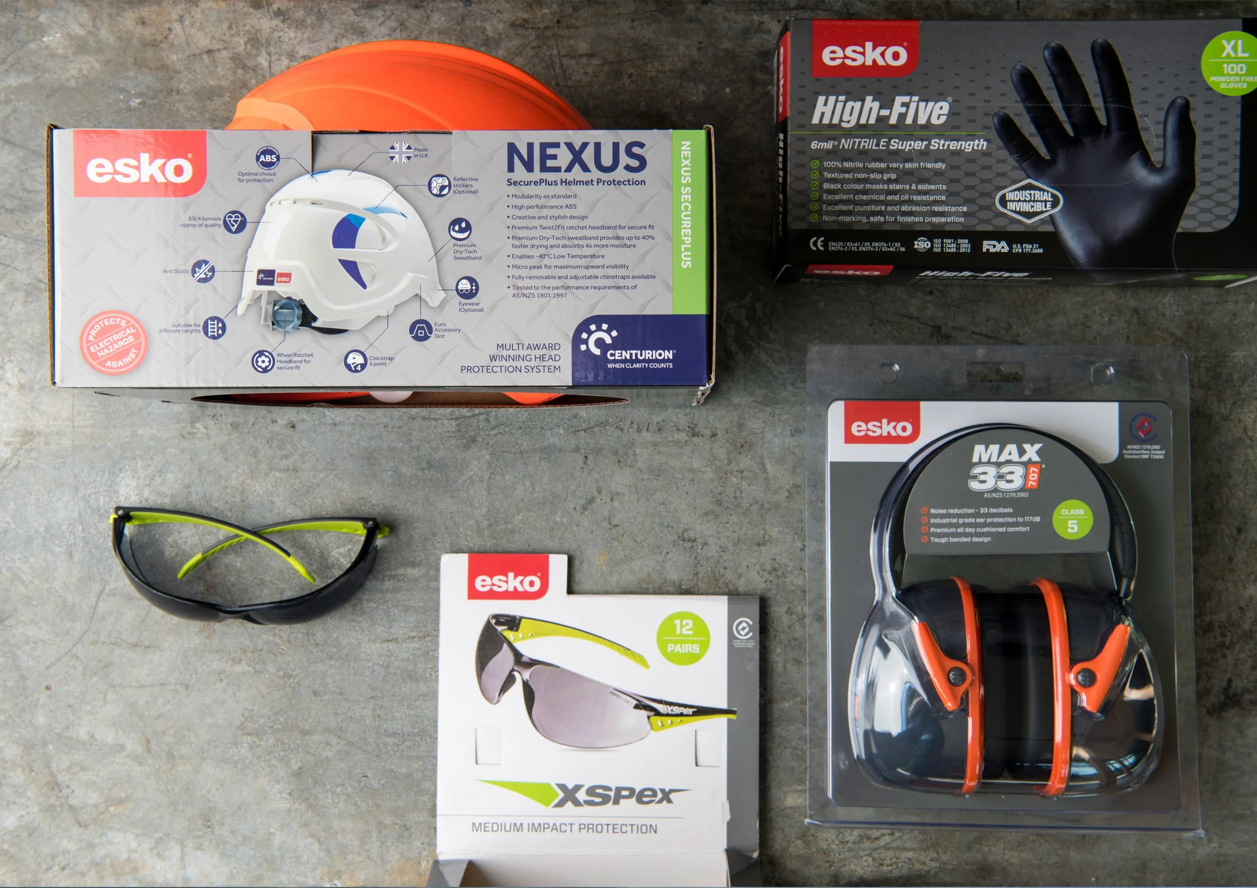
SCOPE: PACKAGING DESIGN, ICONOGRAPHY
*
SCOPE: PACKAGING DESIGN, ICONOGRAPHY *
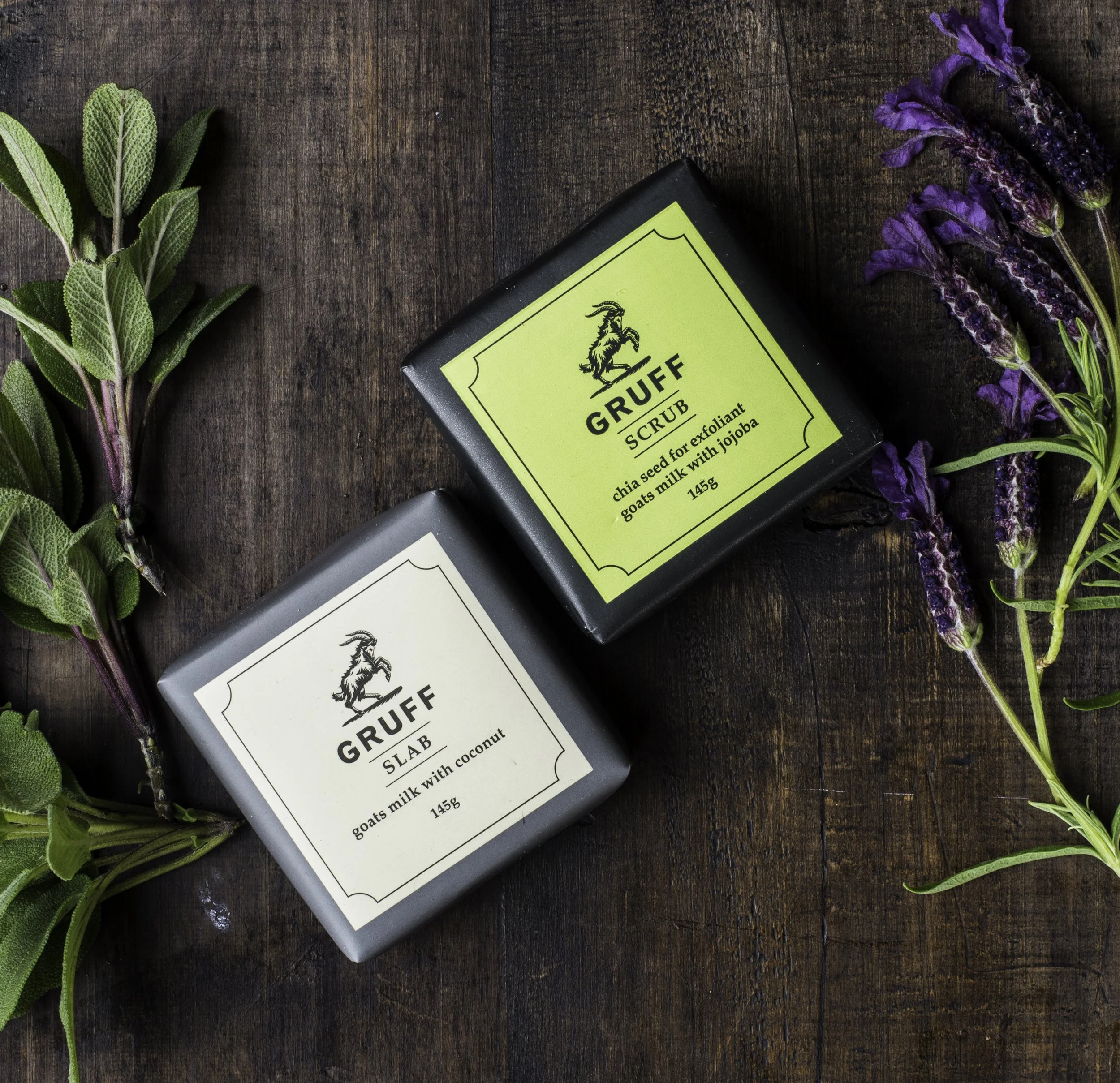
Giving Gruff a Good 'Scrub Up'
*
Giving Gruff a Good 'Scrub Up' *
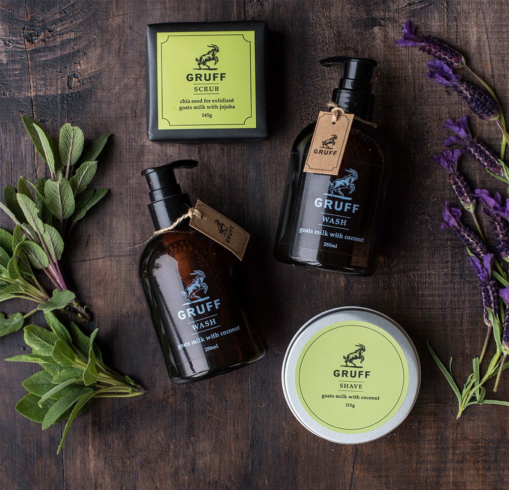
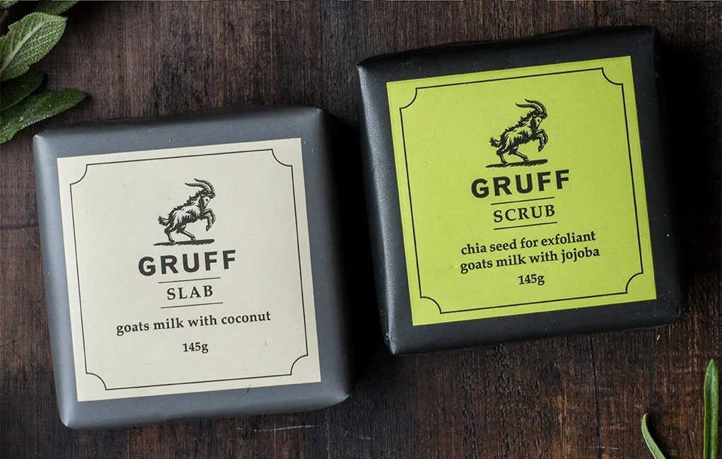
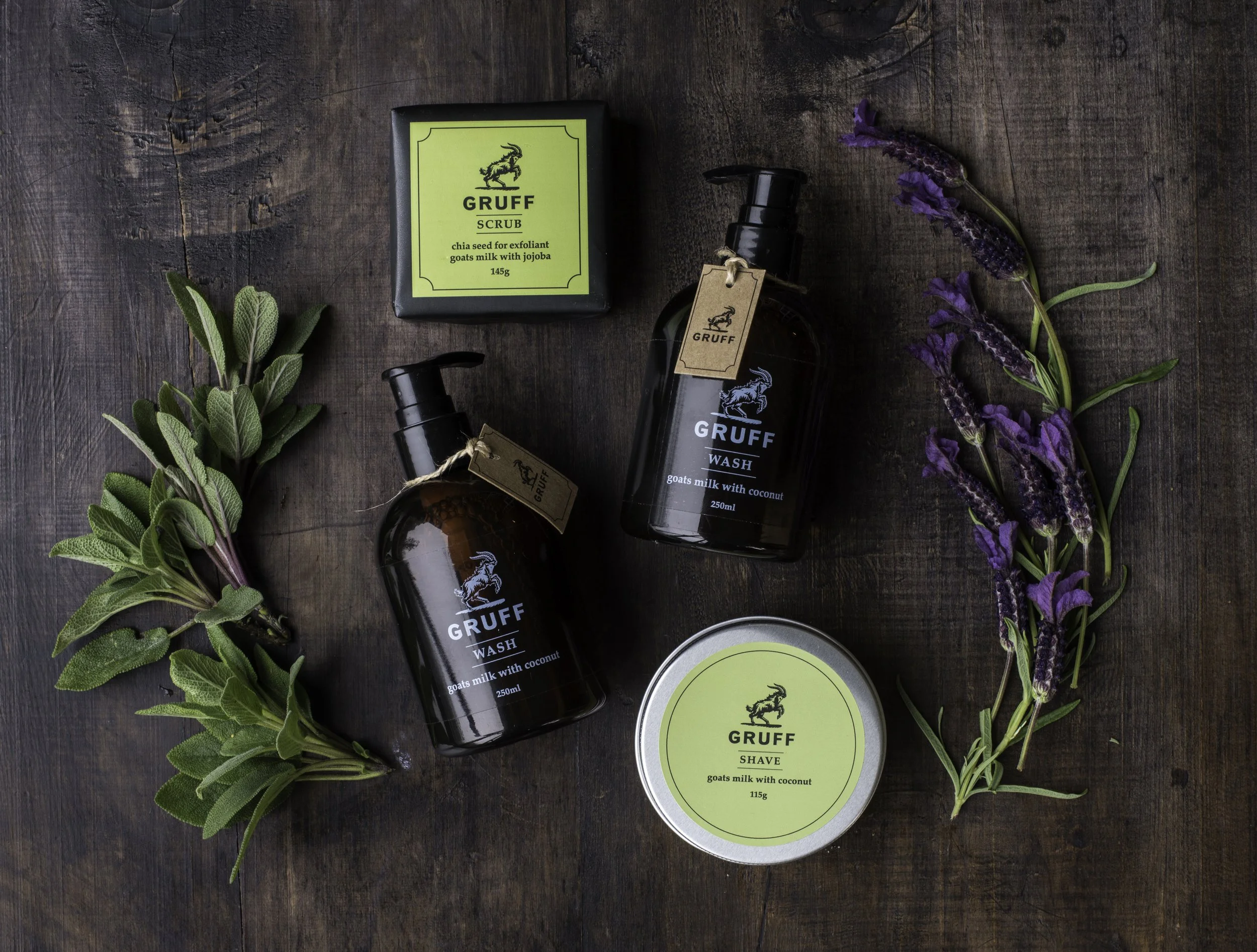
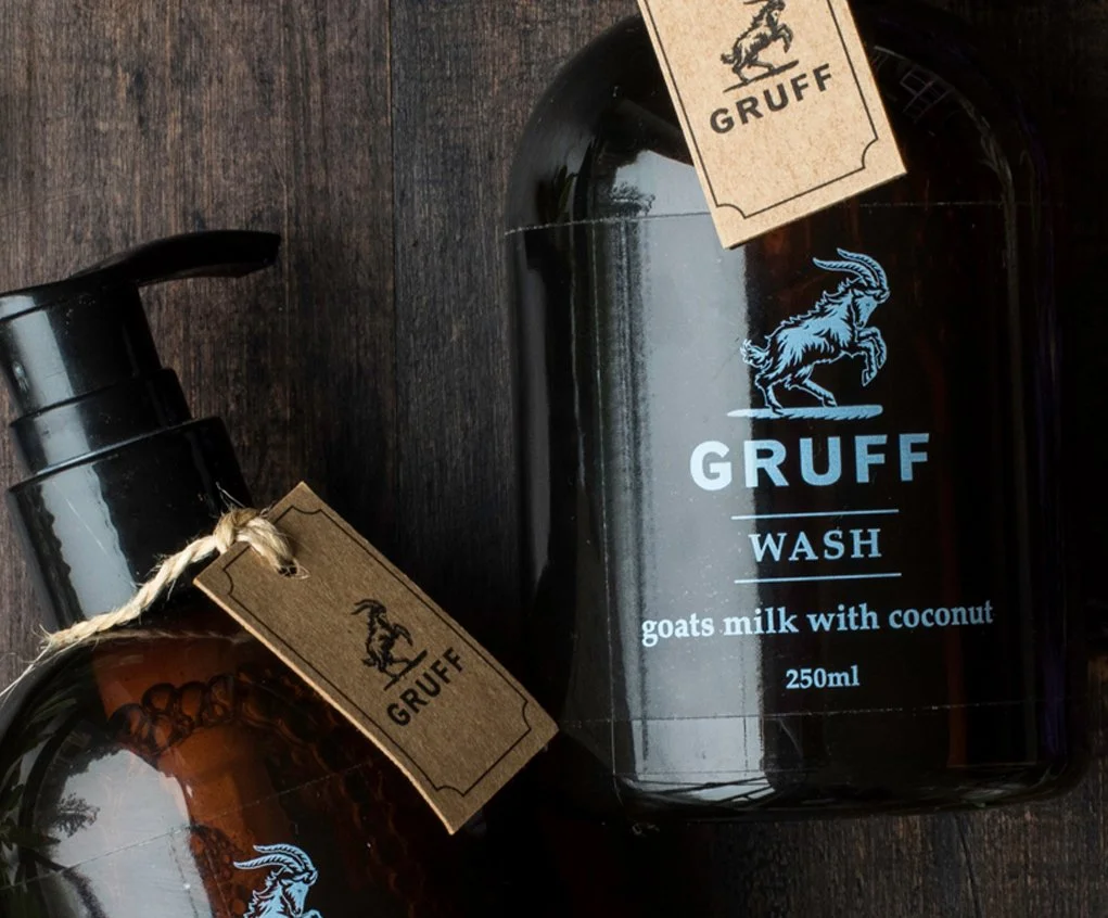
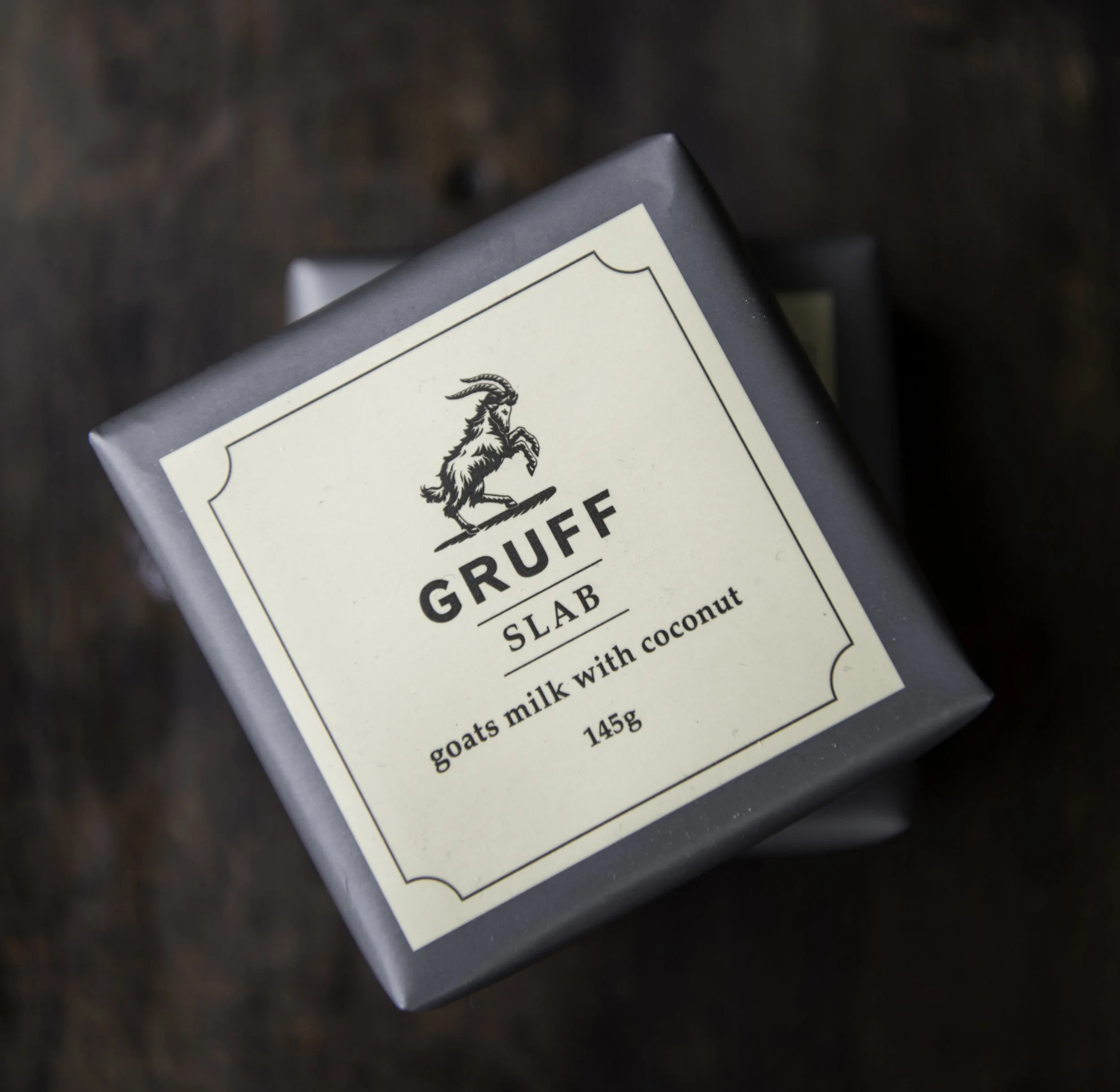
Gruff came to me with a clear vision: a premium organic skincare brand built for men who care about what they put on their skin and what that means for the planet. The challenge was to make something that felt genuinely masculine without resorting to the dark, heavy-handed design that dominates male grooming. Working with Sam Sakaria, we developed the Gruff goat icon. A mark that carries both strength and elegance in equal measure. A natural colour palette and deliberately minimal design let the organic credentials speak for themselves. For Gruff, less is very much more.
SCOPE: DESIGN STRATEGY, BRAND IDENTITY & PACKAGING DESIGN, ARTWORK PRODUCTION, POINT OF SALE
*
SCOPE: DESIGN STRATEGY, BRAND IDENTITY & PACKAGING DESIGN, ARTWORK PRODUCTION, POINT OF SALE *
Like what you see..?
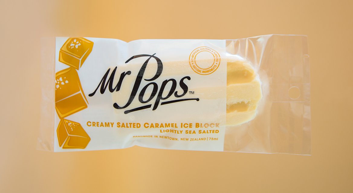
Pure Design for the Purest Iceblocks
*
Pure Design for the Purest Iceblocks *
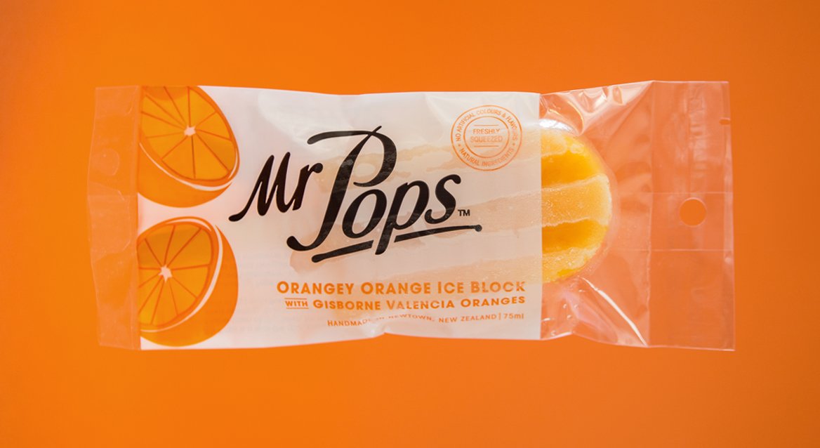
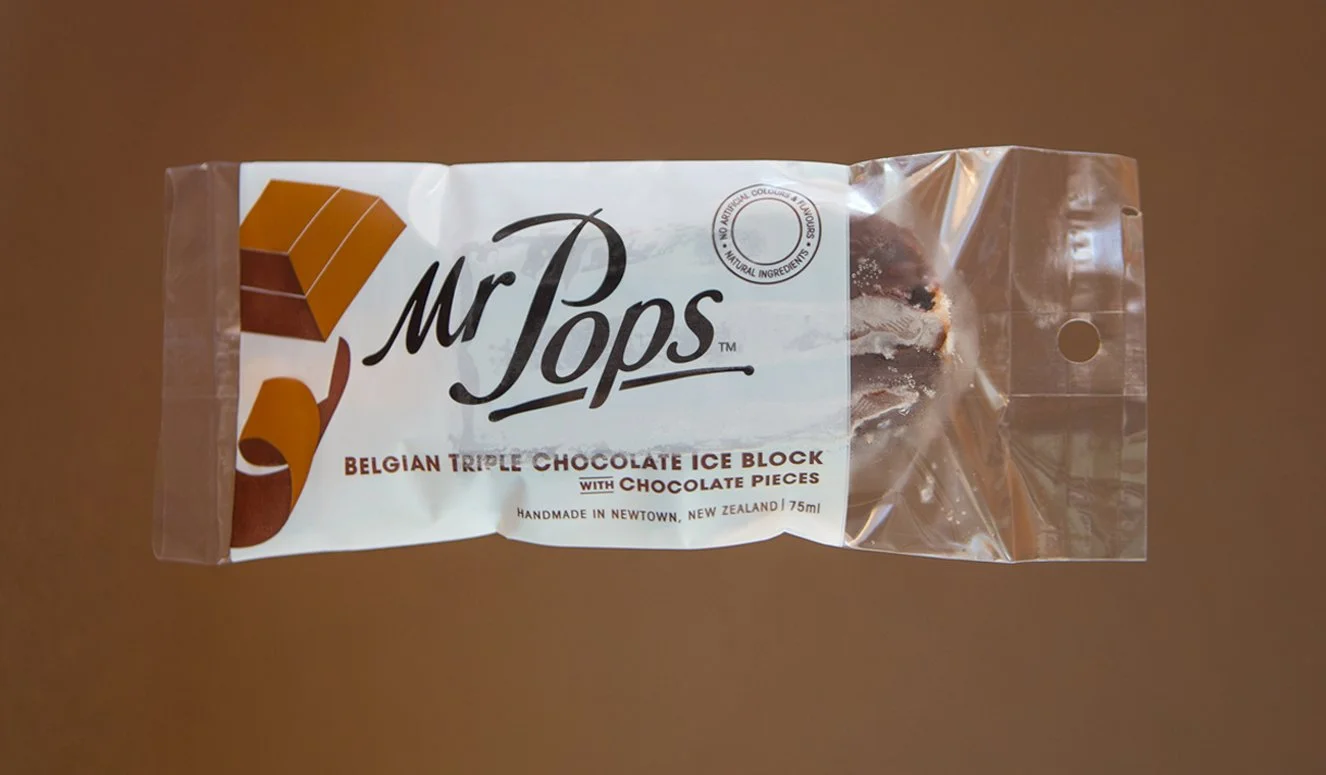
Most iceblocks shout. Mr Pops doesn't need to. Nathan Meyer of Carrello Del Gelato had a simple but powerful idea: premium iceblocks made from natural local ingredients for adults who appreciate the real thing. Belgian triple chocolate. Flat white. Flavours that deserved better than the neon packaging dominating the category. A crisp white canvas, warm illustrations and a bespoke hand-crafted brand mark gave Mr Pops its own corner of the freezer, and a look that's as honest as the ingredients inside.
SCOPE: BRAND STRATEGY, BRAND IDENTITY & PACKAGING DESIGN, ILLUSTRATION, ARTWORK PRODUCTION
*
SCOPE: BRAND STRATEGY, BRAND IDENTITY & PACKAGING DESIGN, ILLUSTRATION, ARTWORK PRODUCTION *
Delicious Designs Deserve to Fly First Class
*
Delicious Designs Deserve to Fly First Class *
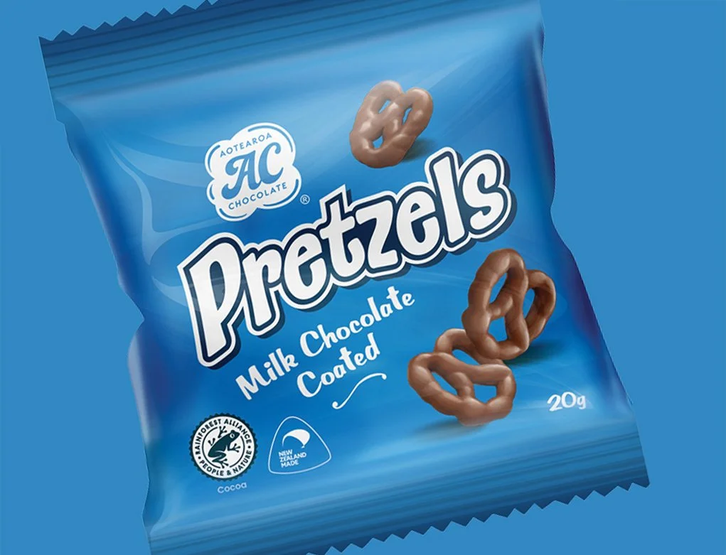
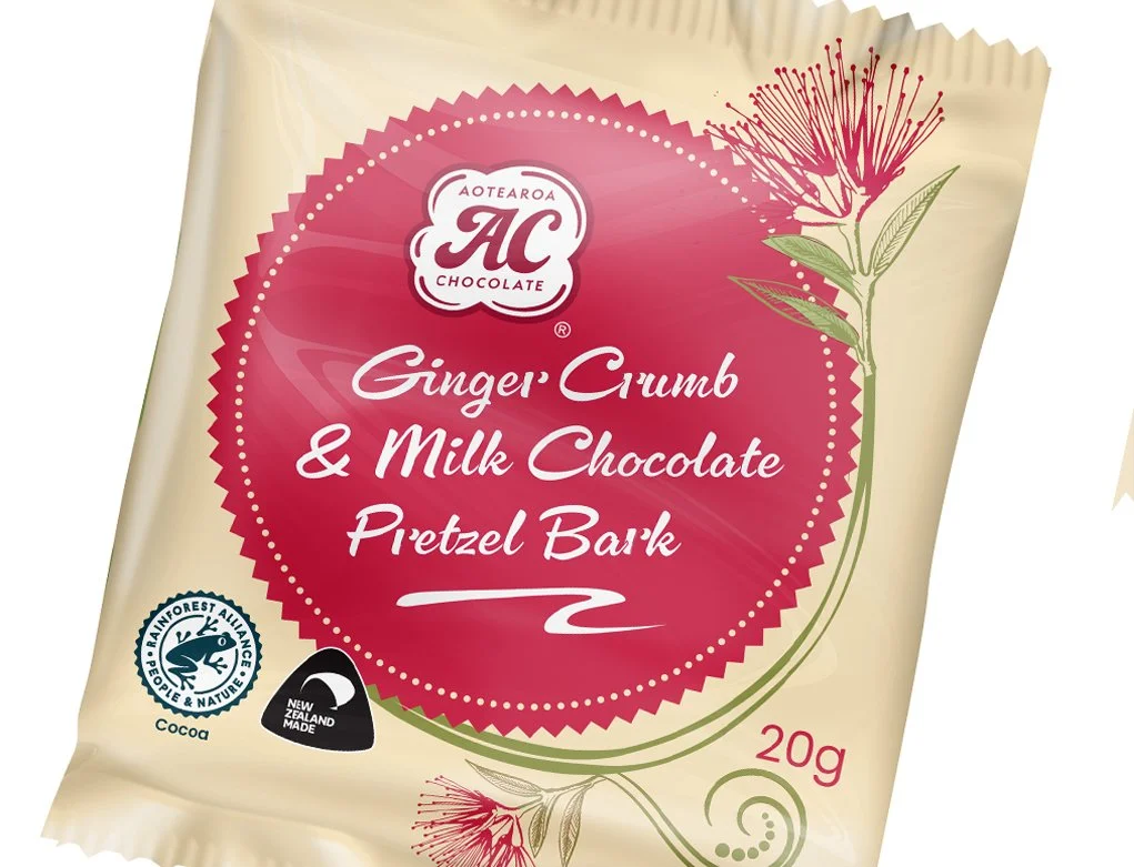
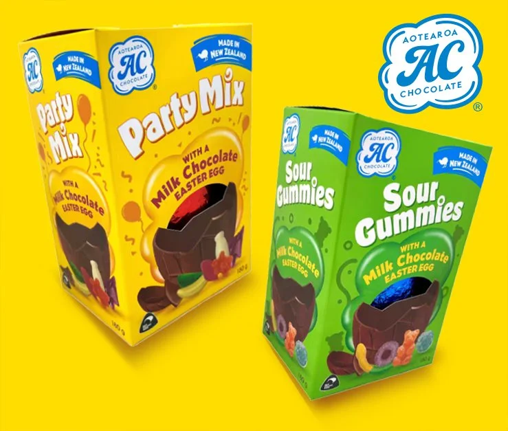
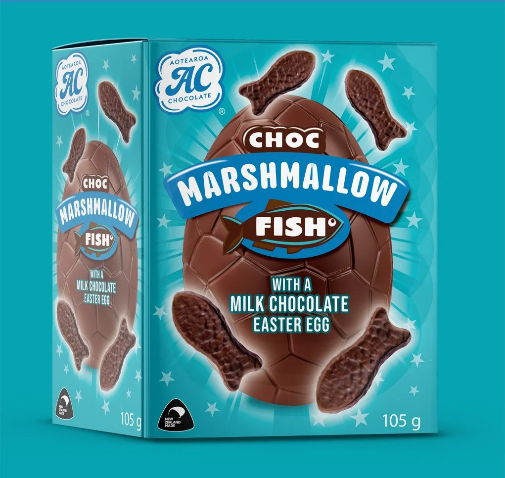
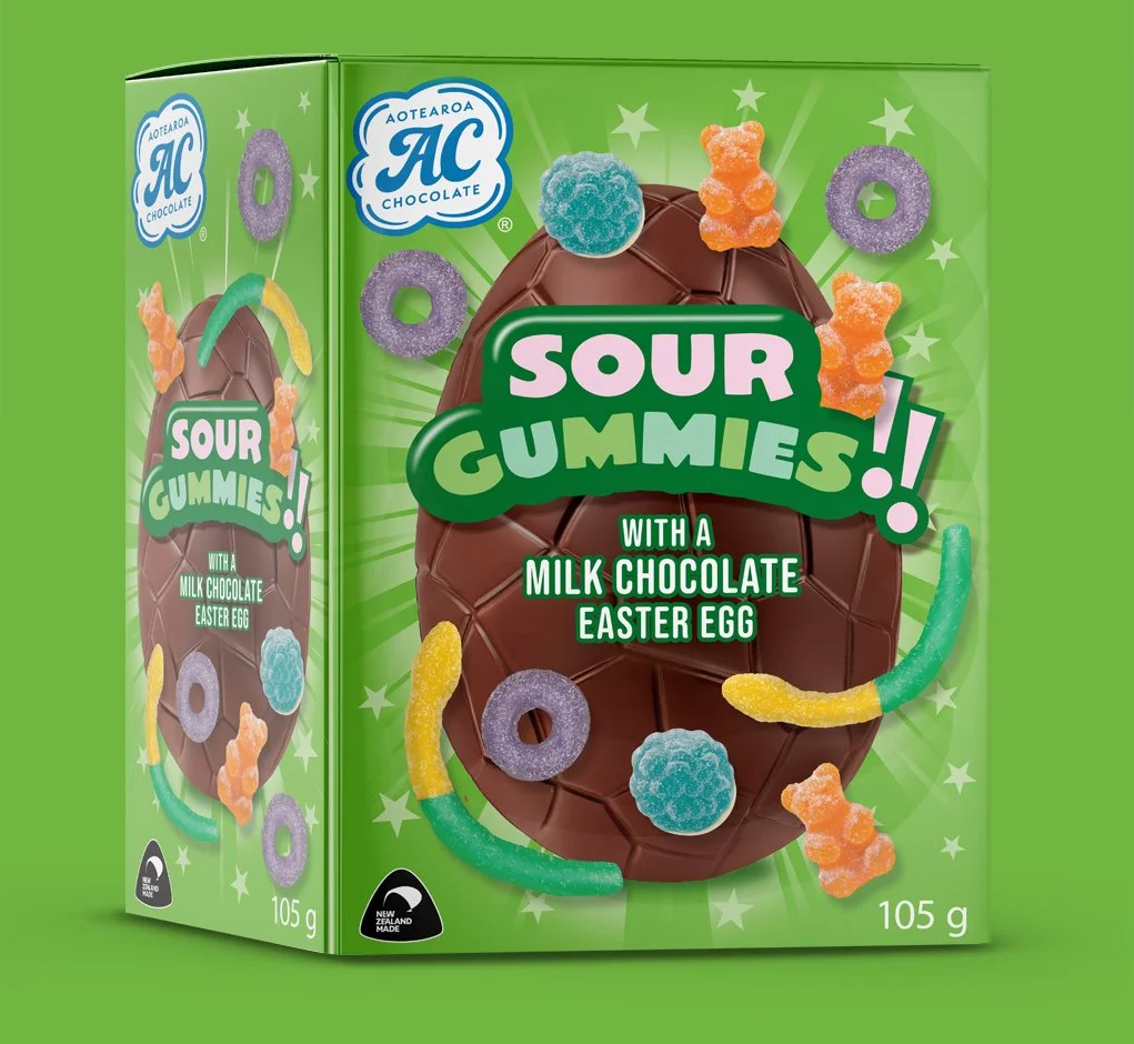
When Aotearoa Chocolate's packaging caught the attention of Air New Zealand's nationwide snack search, it wasn't by accident. The brief was to create something that felt genuinely local, fun, approachable and rooted in New Zealand identity. The cloud logo, a direct nod to Aotearoa's most iconic descriptor, gave the brand an instantly meaningful visual anchor. The chocolate coated pretzels went on to win a place on Air New Zealand flights, and Woolworths has since listed all four flavours nationally.
SCOPE: BRAND IDENTITY, PACKAGING DESIGN, ARTWORK PRODUCTION
*
SCOPE: BRAND IDENTITY, PACKAGING DESIGN, ARTWORK PRODUCTION *
Like what you see..?

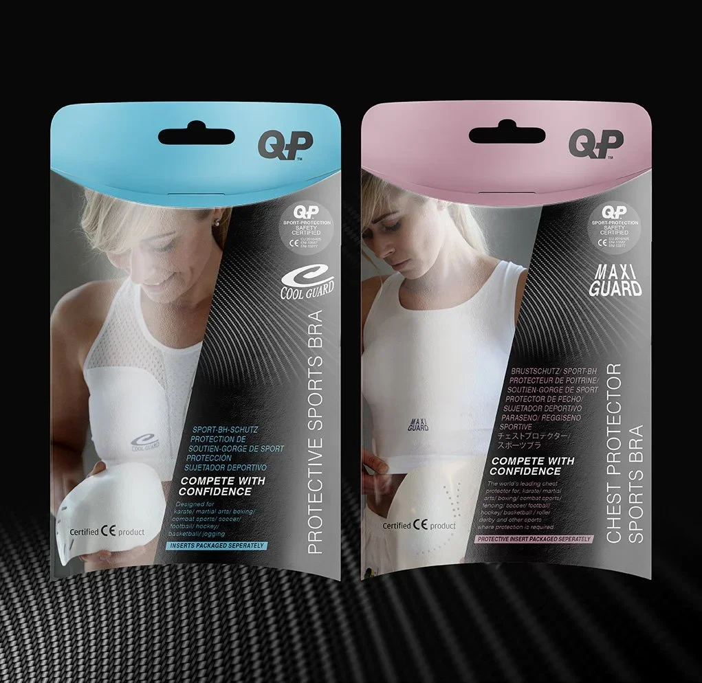
When your product gives people the confidence to compete, your packaging needs to inspire the same feeling. QP Sport came to me with a brief to modernise their range of breast and chest protection packaging. Bringing it in line with their reputation for innovation while solving a practical challenge: a structure that works as well flat-packed for international export as it does displayed on a retail shelf. A bespoke 3D structure and sharper, more dynamic graphics delivered on both.
Competitive Design meets Competitive Sports
*
Competitive Design meets Competitive Sports *
SCOPE: 3D AND 2D PACKAGING DESIGN, ARTWORK PRODUCTION
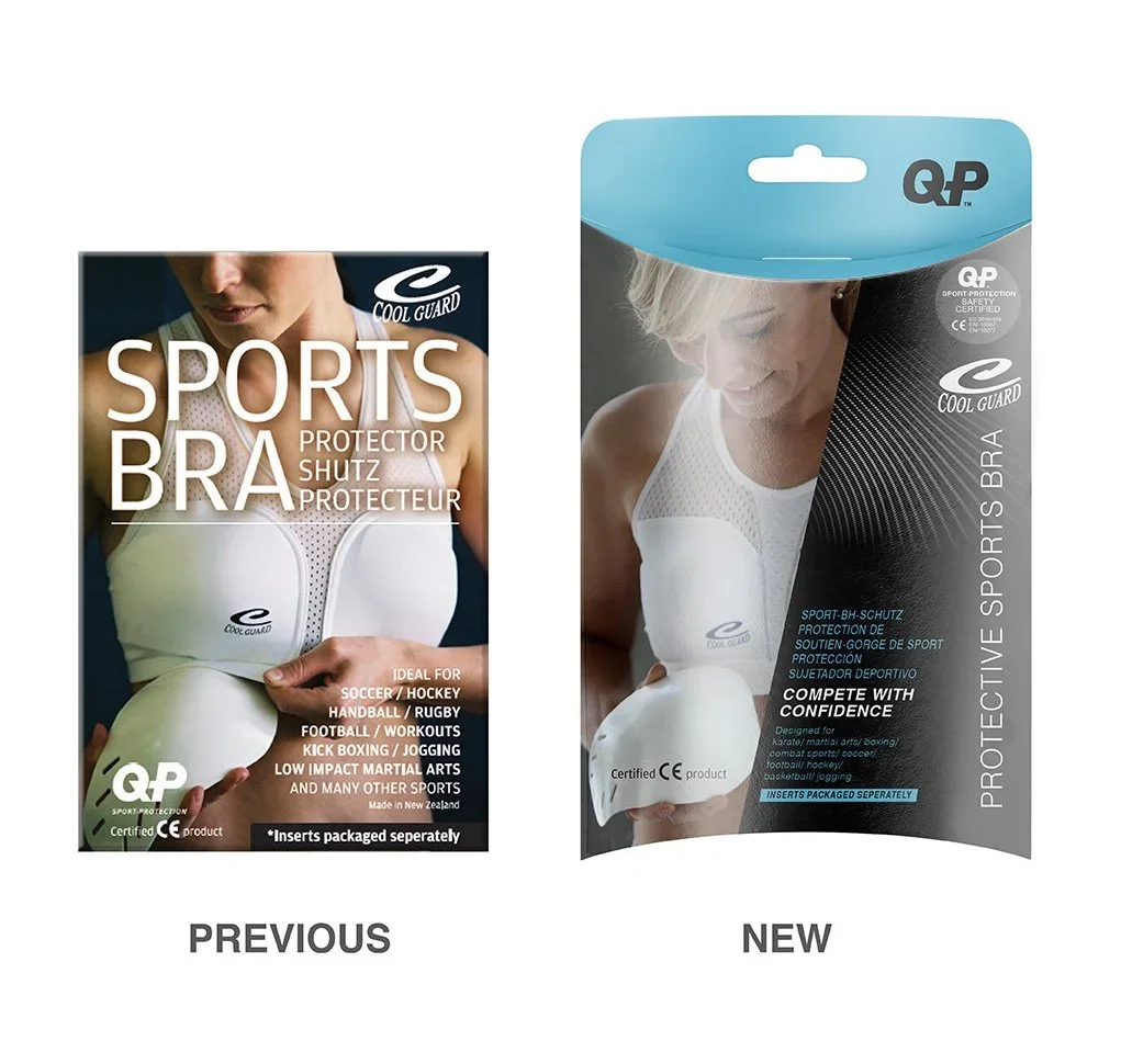
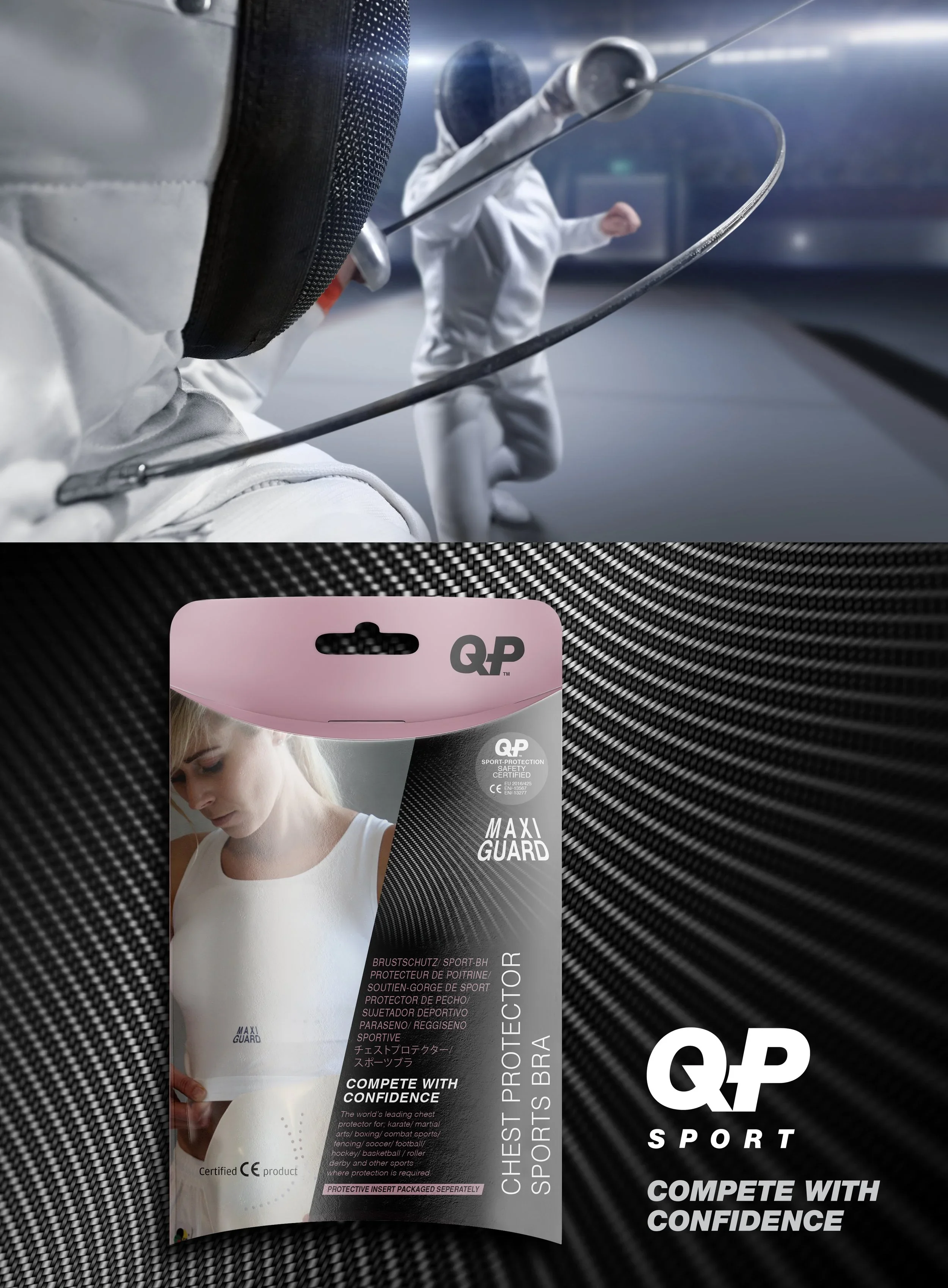
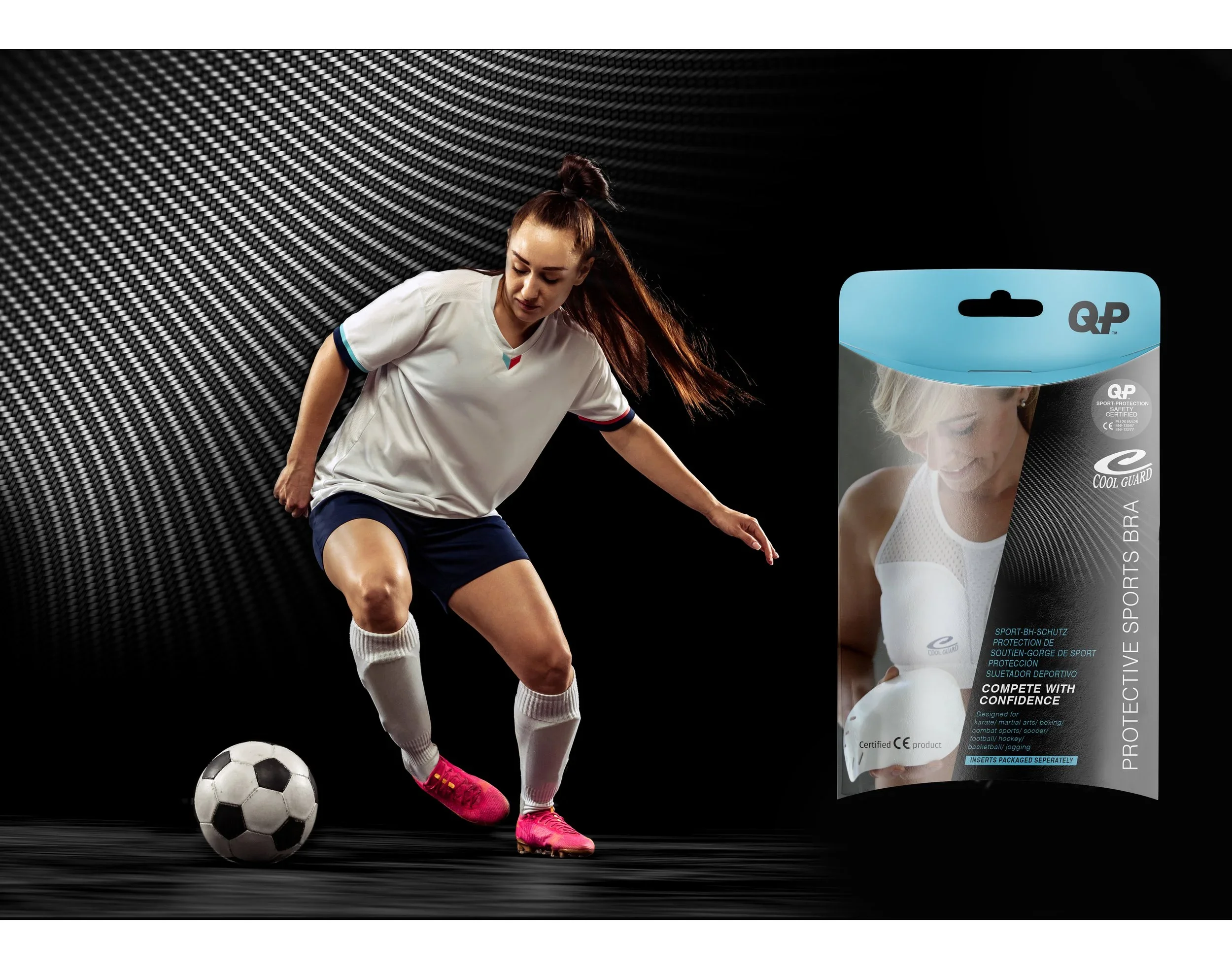
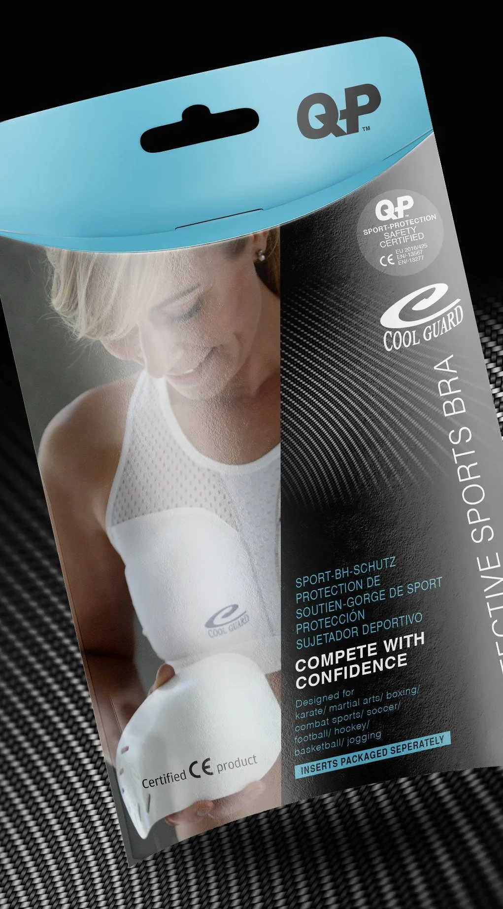
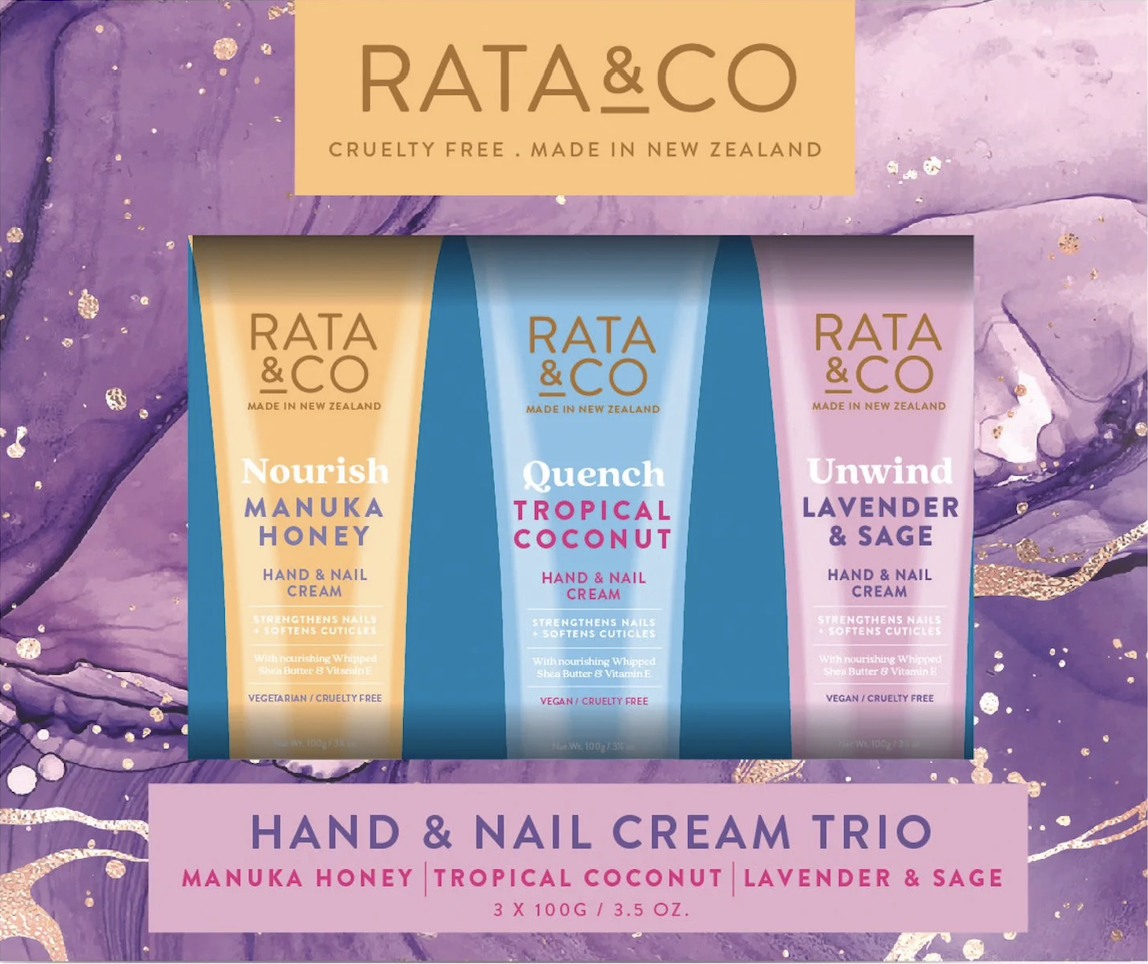
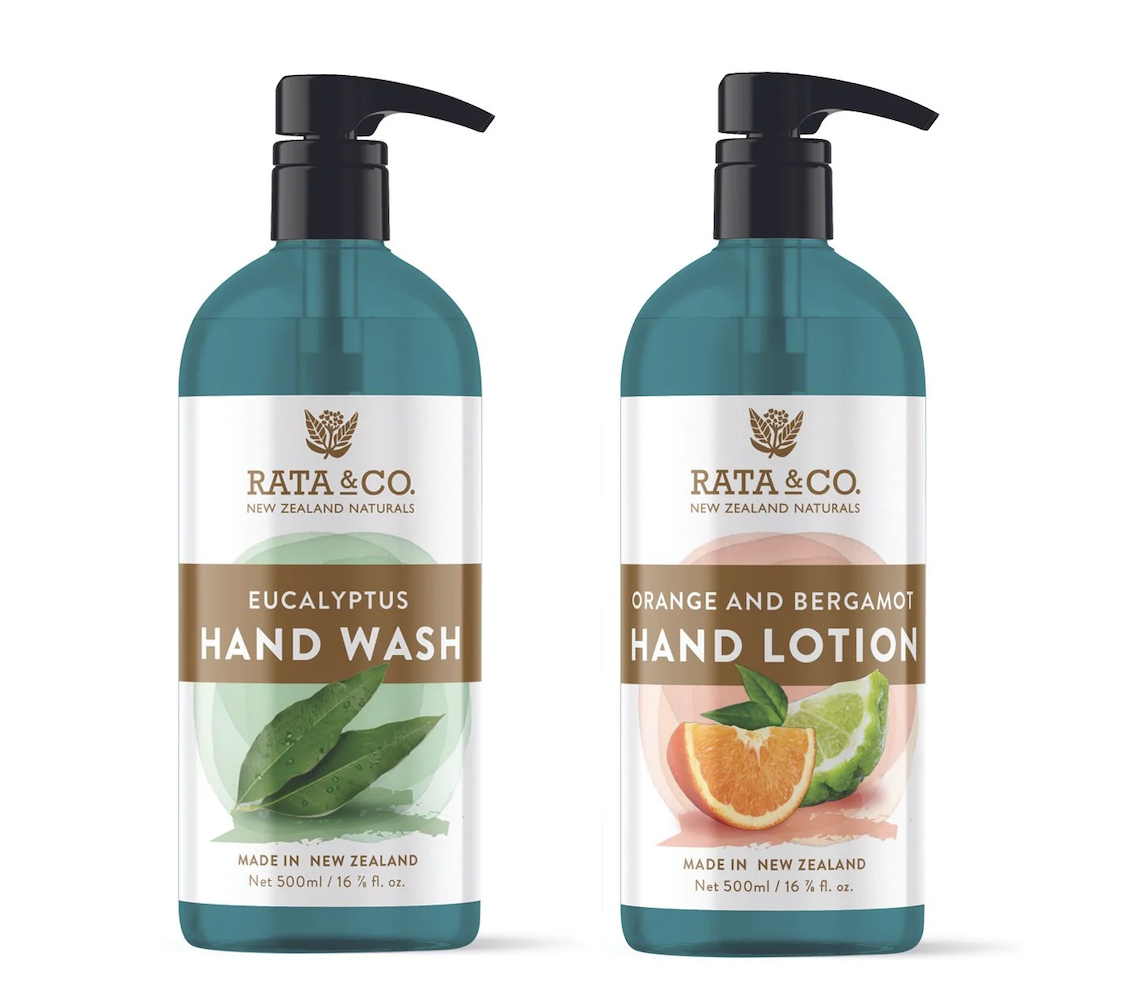
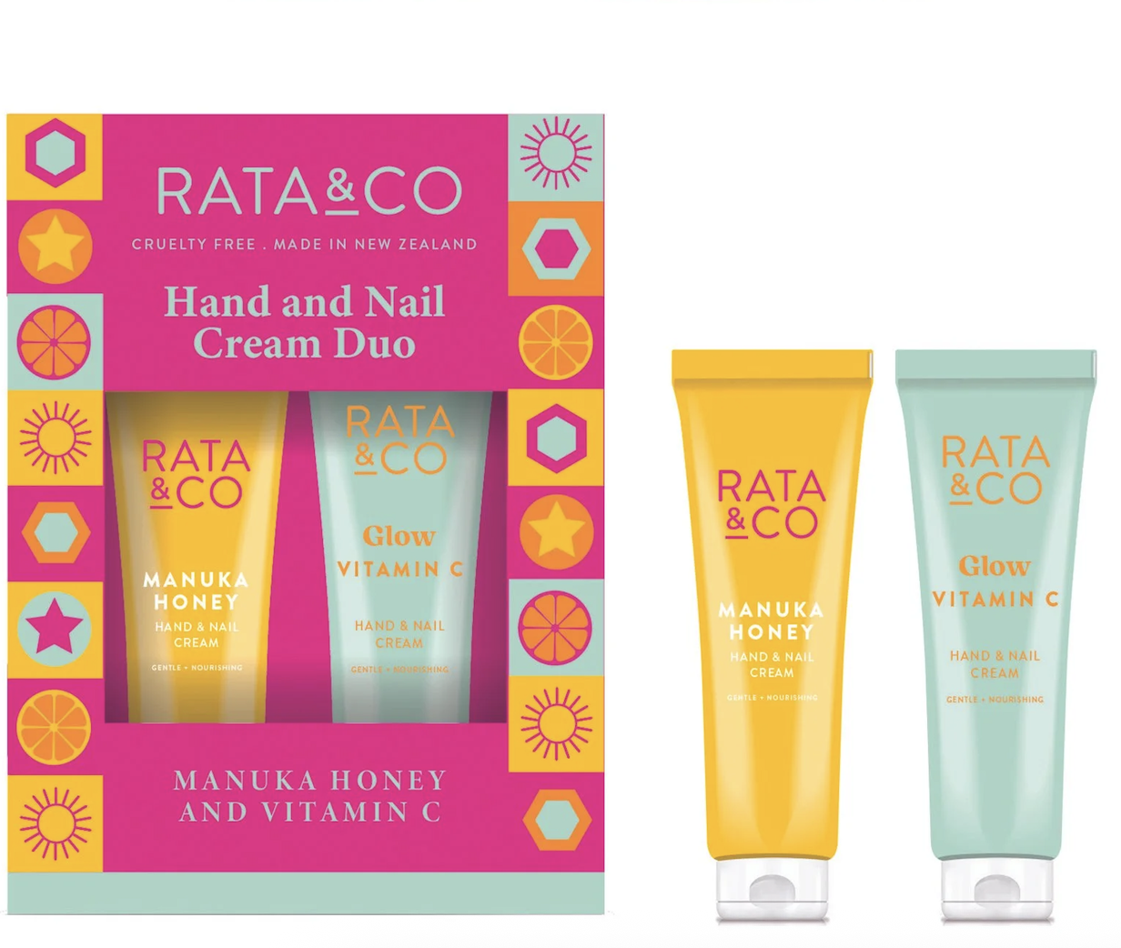
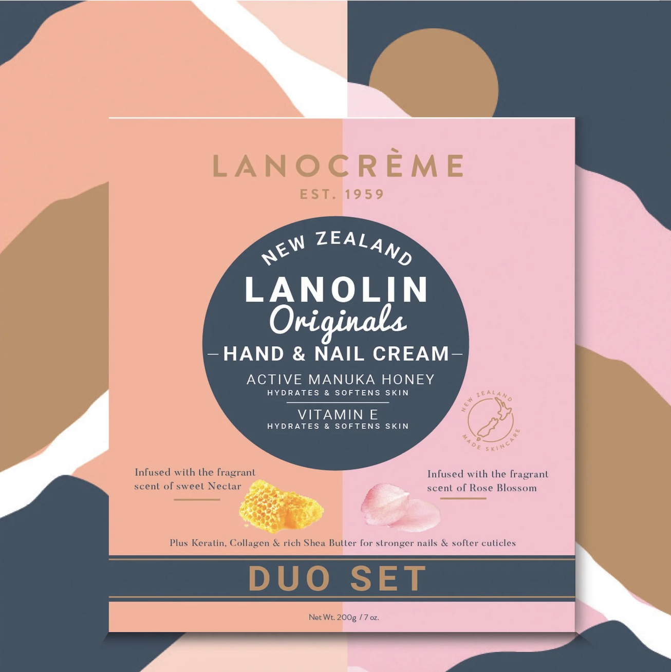
Lanocorp came to me with a gifting challenge: create multi-box packaging for their Rata & Co and Lanocreme skincare ranges that felt premium enough to stand out in a competitive beauty market, while staying true to the personality of each individual brand. The result is a suite of designs that sit beautifully on shelf, and even more beautifully in a gift bag. Lanocreme Duo is now available at Auckland International Airport Duty Free, making it one of New Zealand's more elegant travel companions.
Giving the Gift of Great Design
*
Giving the Gift of Great Design *
SCOPE: PACKAGING DESIGN
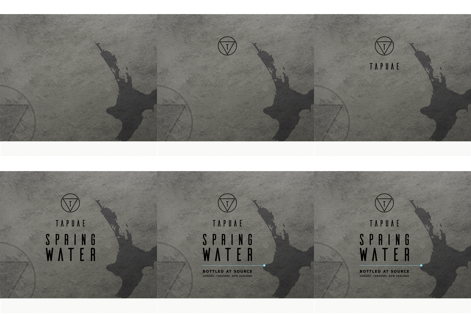
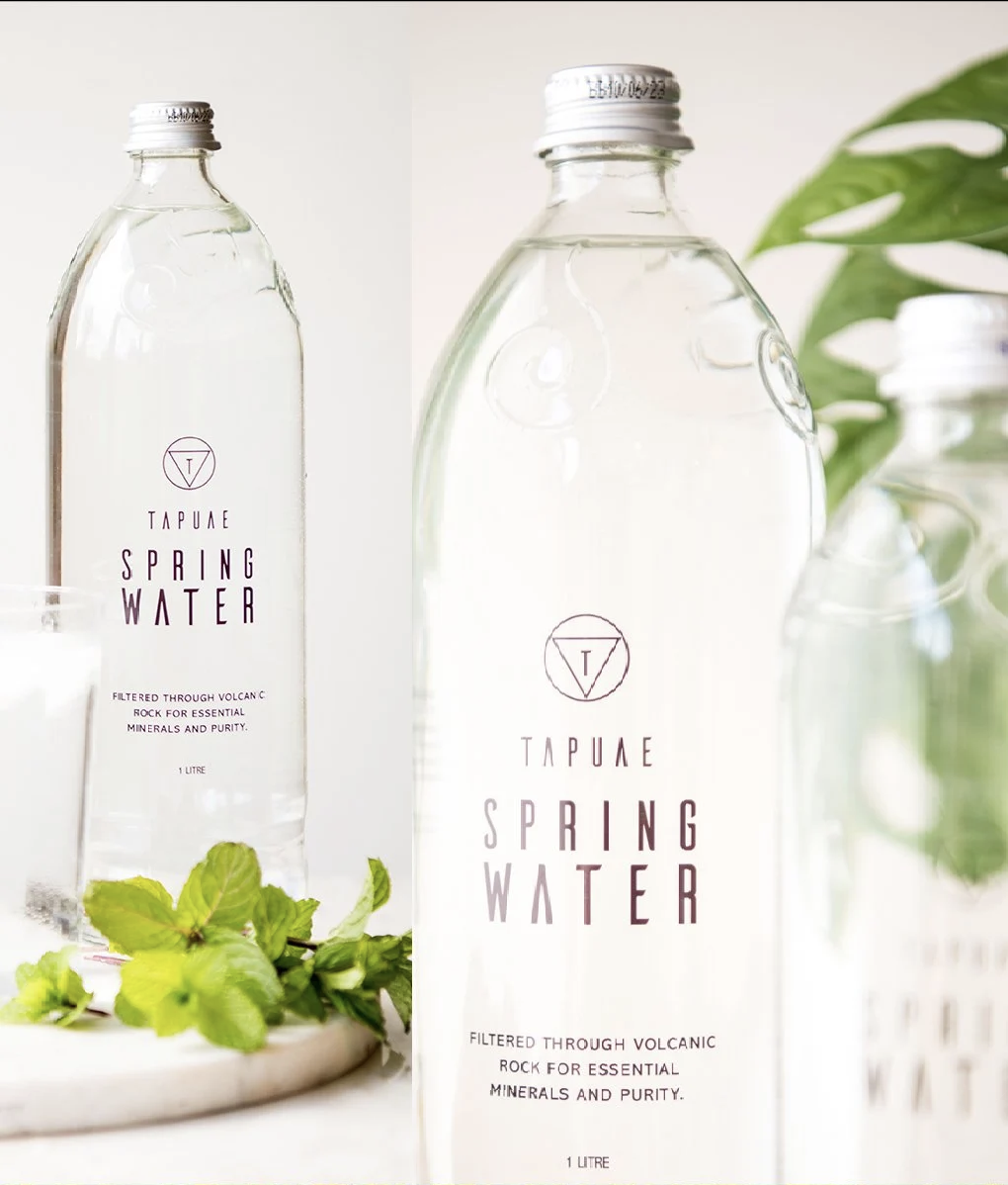
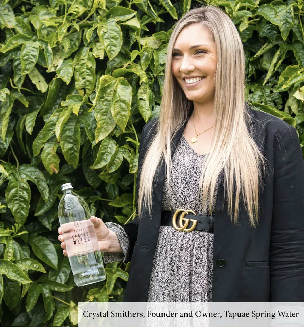
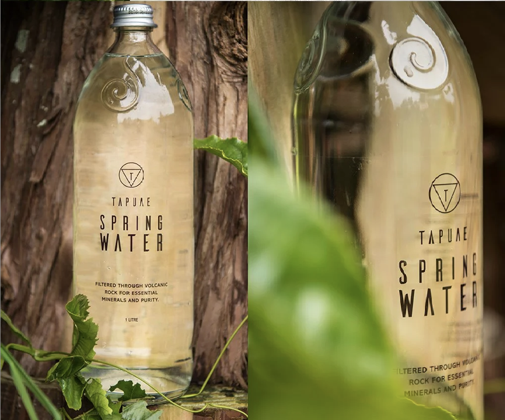
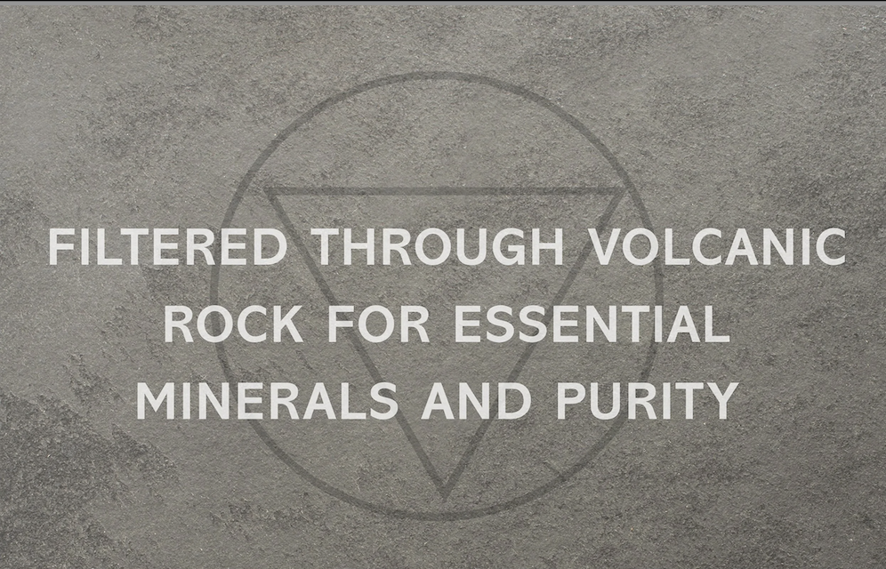
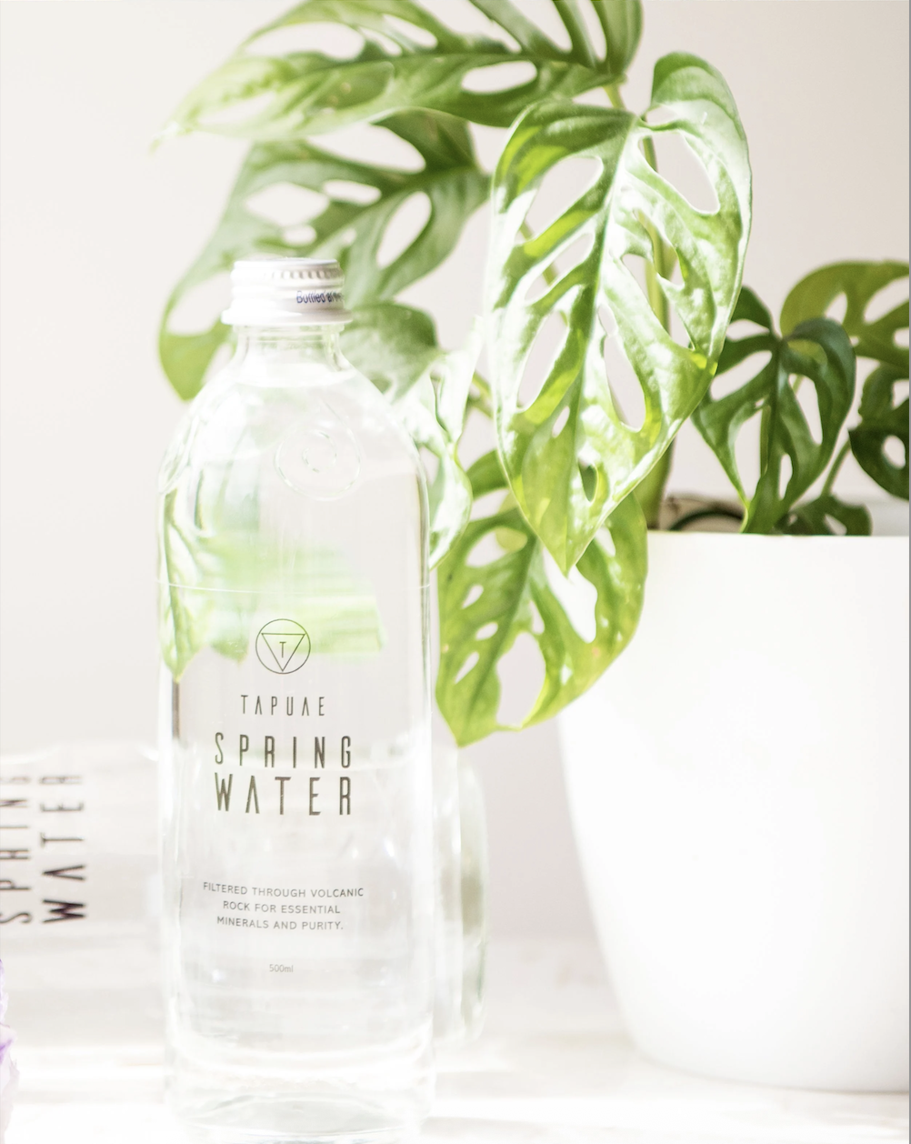
In a category where every brand claims purity, design has to work harder than words. Tapuae Spring Water has a genuinely remarkable story. Water filtered through volcanic rock, naturally mineralised and therapeutically pure. The packaging needed to honour that without overcrowding it. A clear, minimal label keeps the focus on the bottle's elegant structure, while a considered on-pack narrative guides the consumer through the volcanic filtering journey that makes Tapuae what it is.